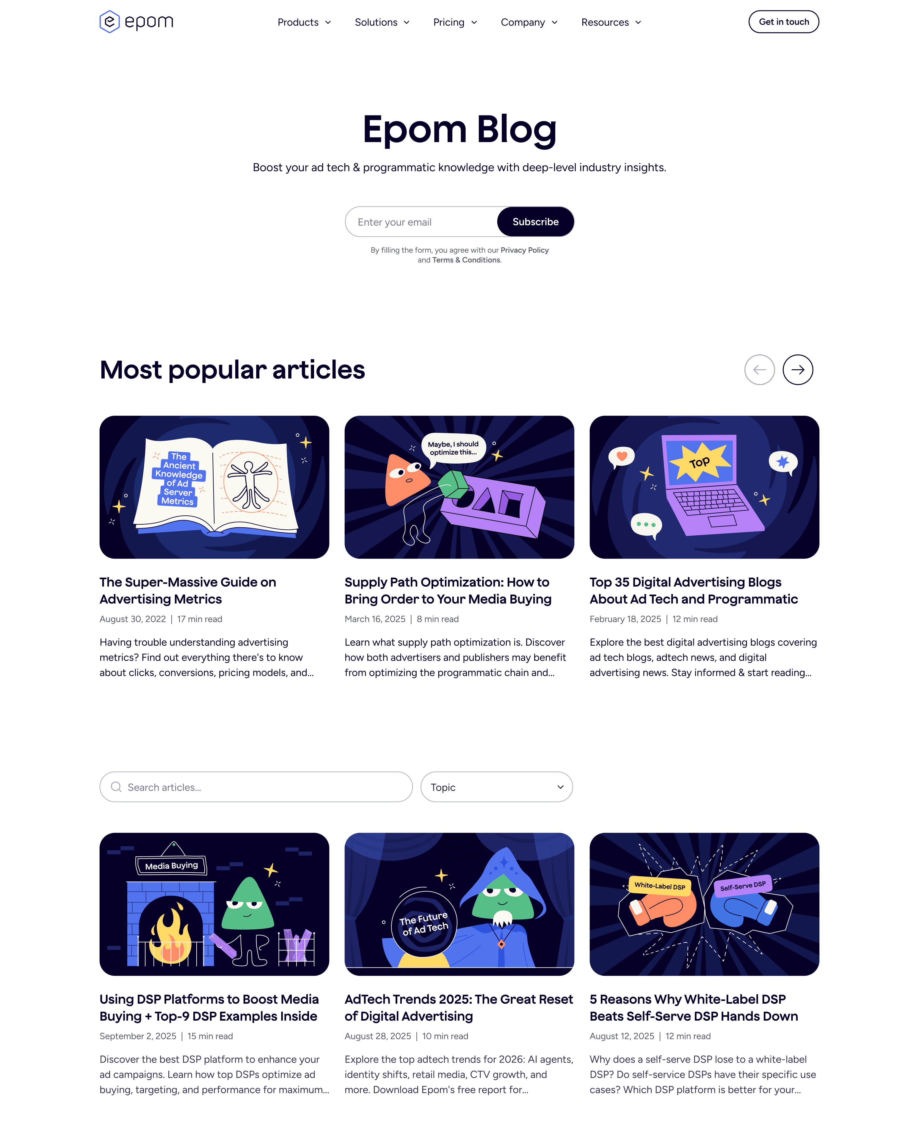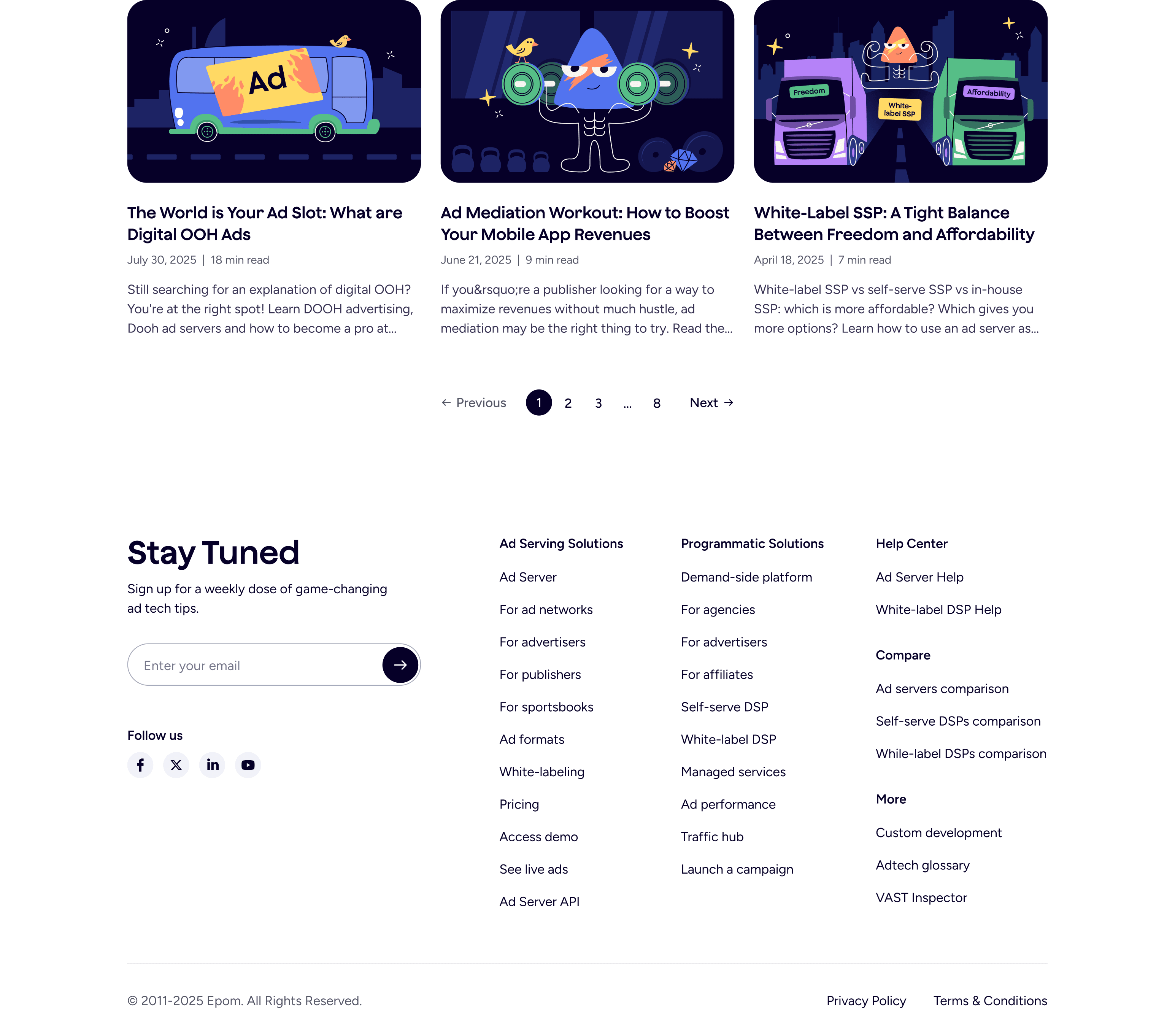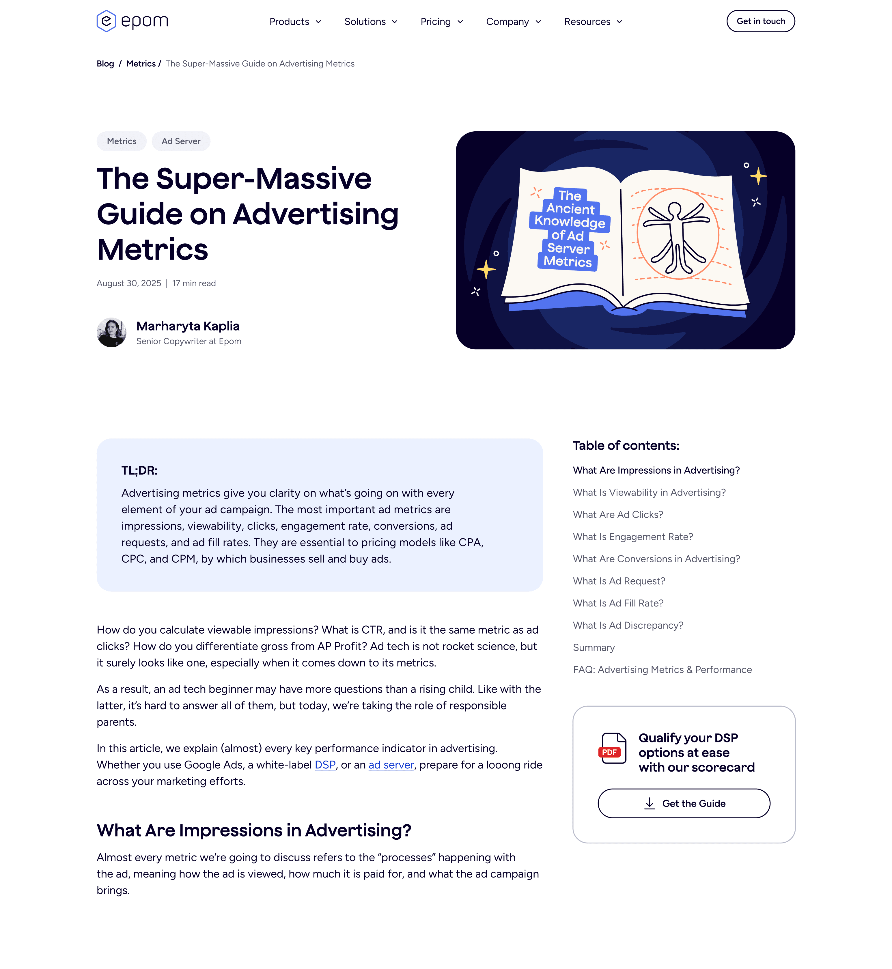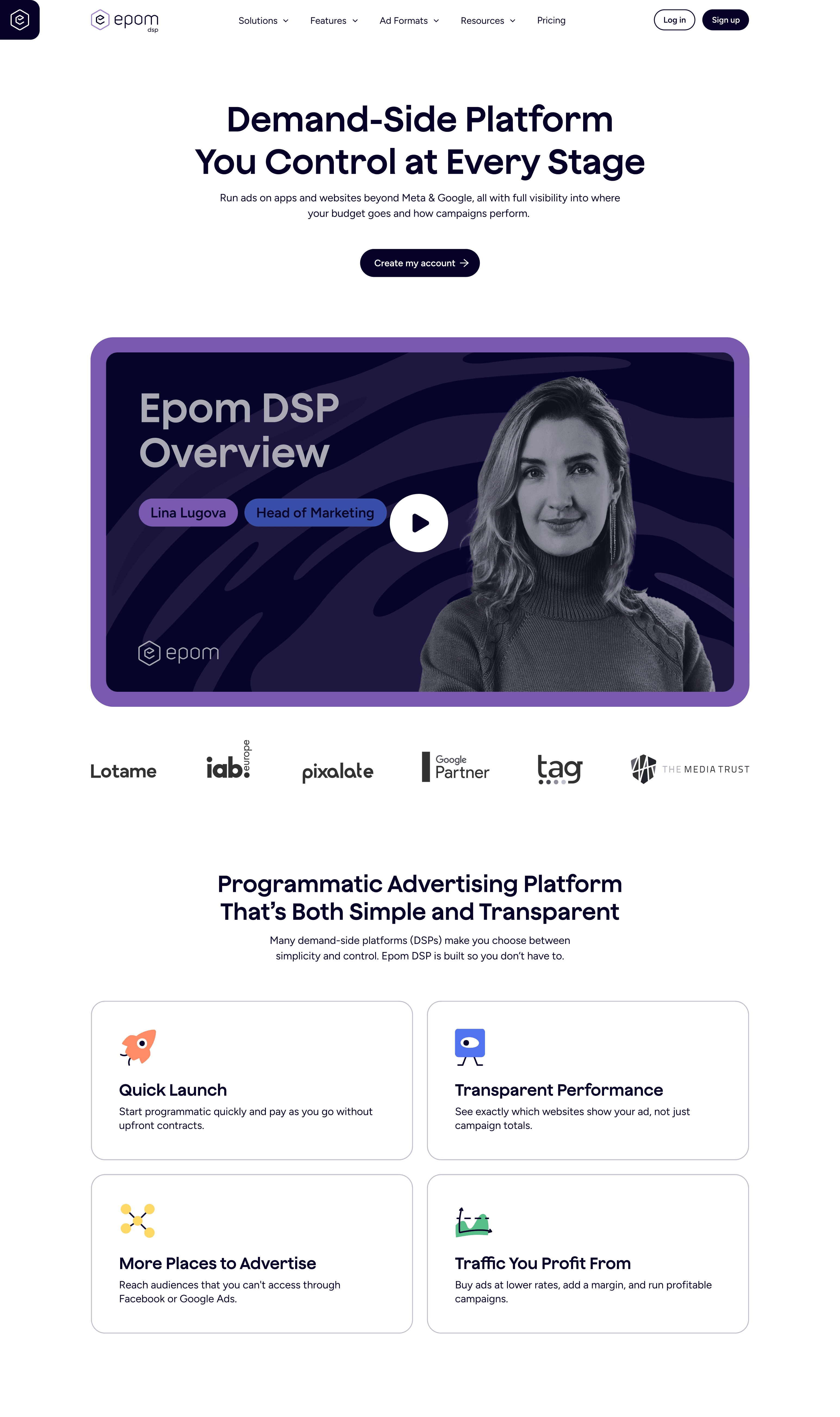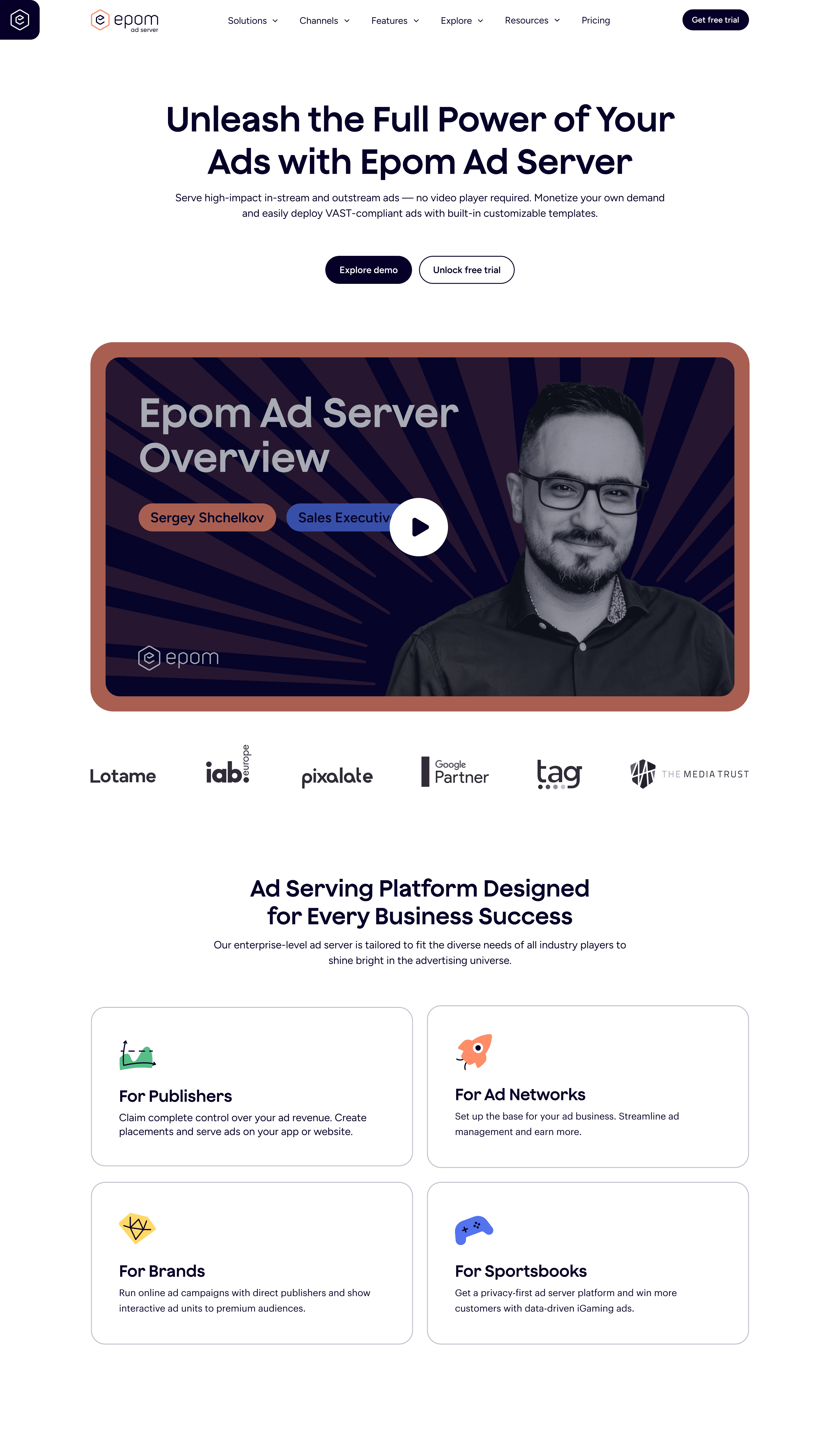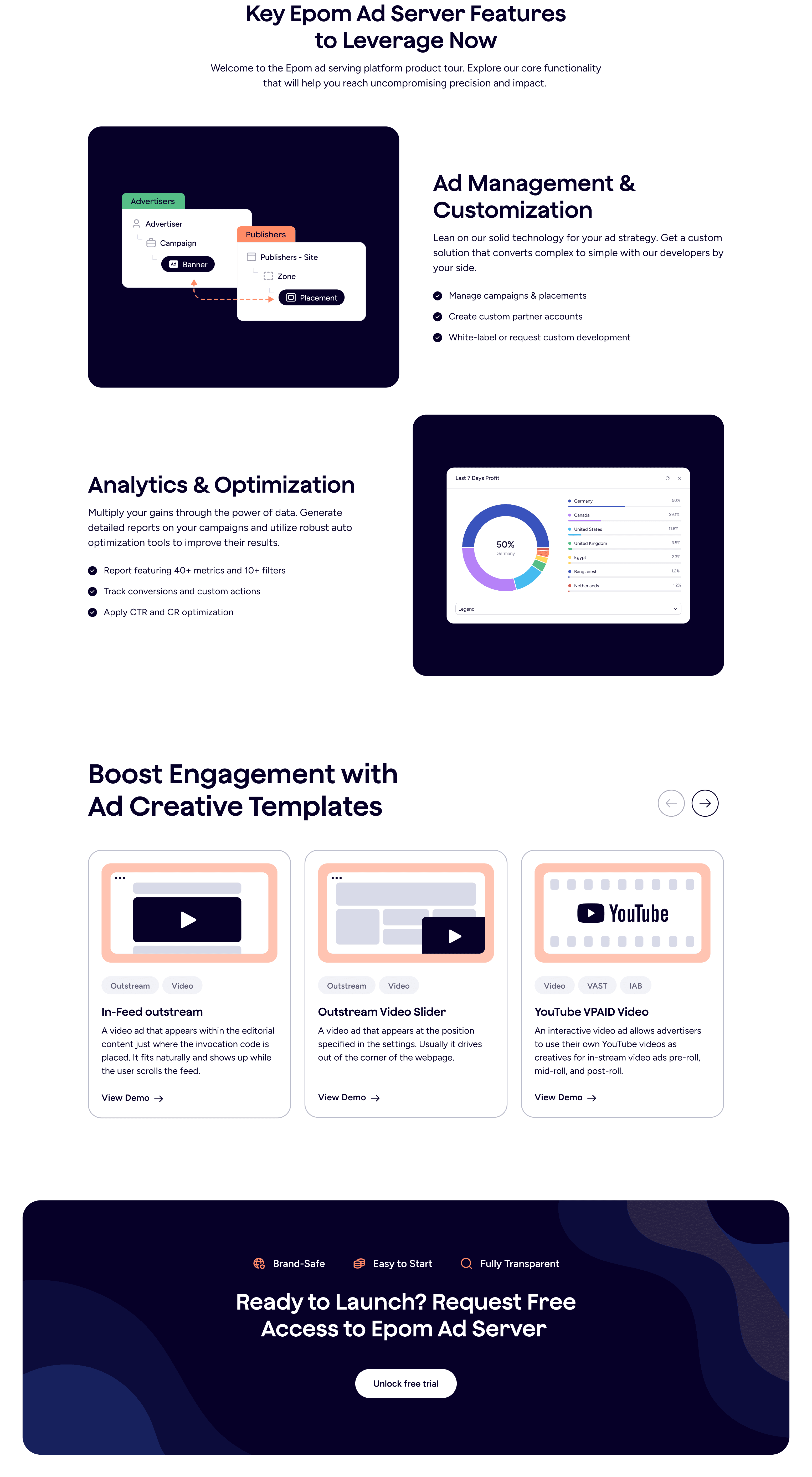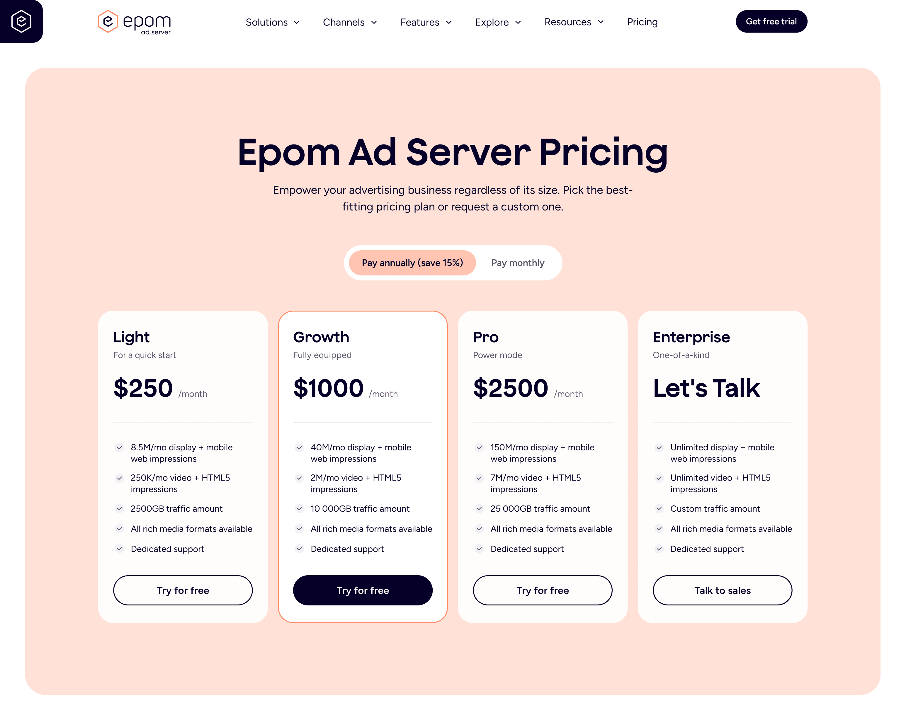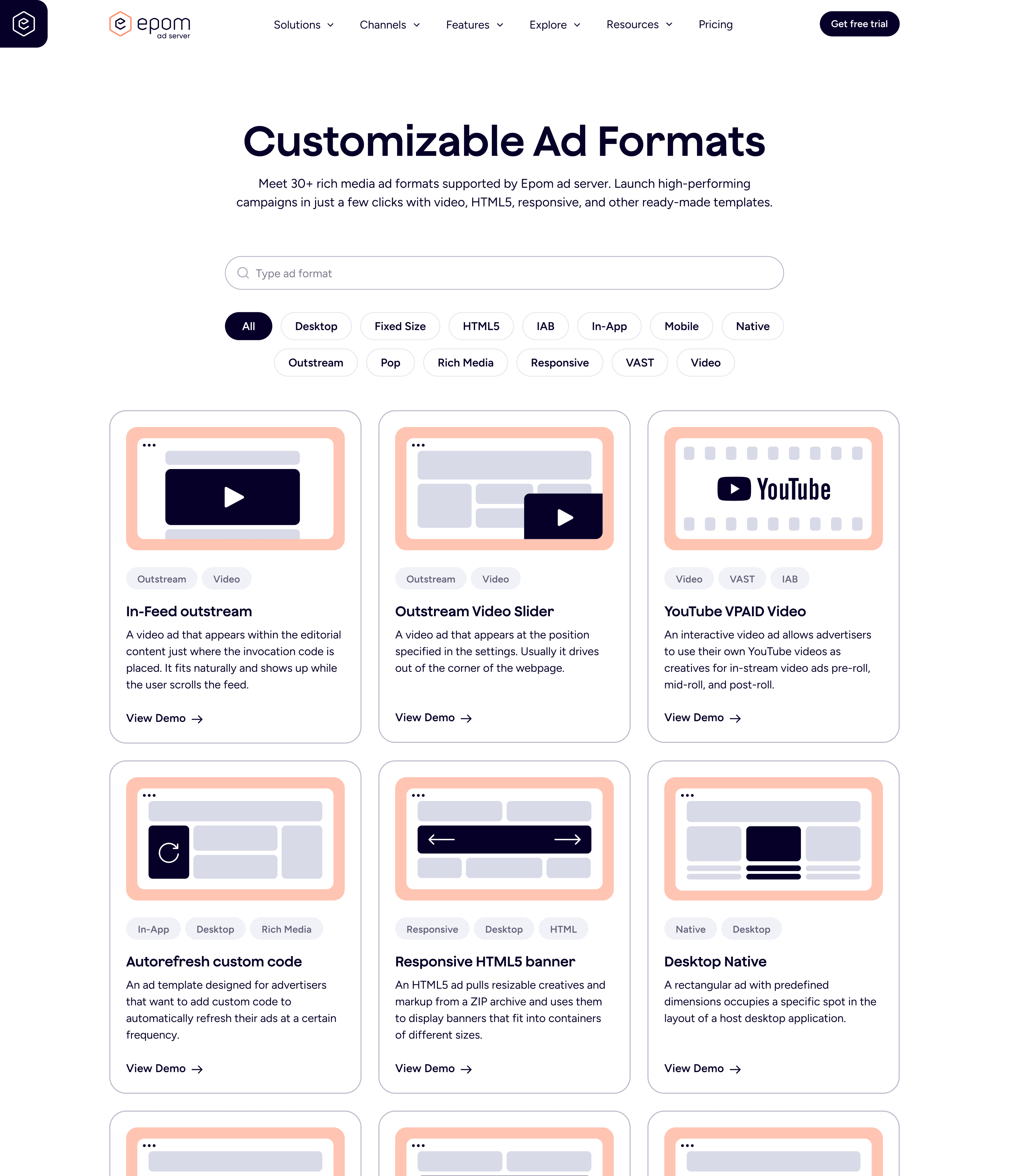
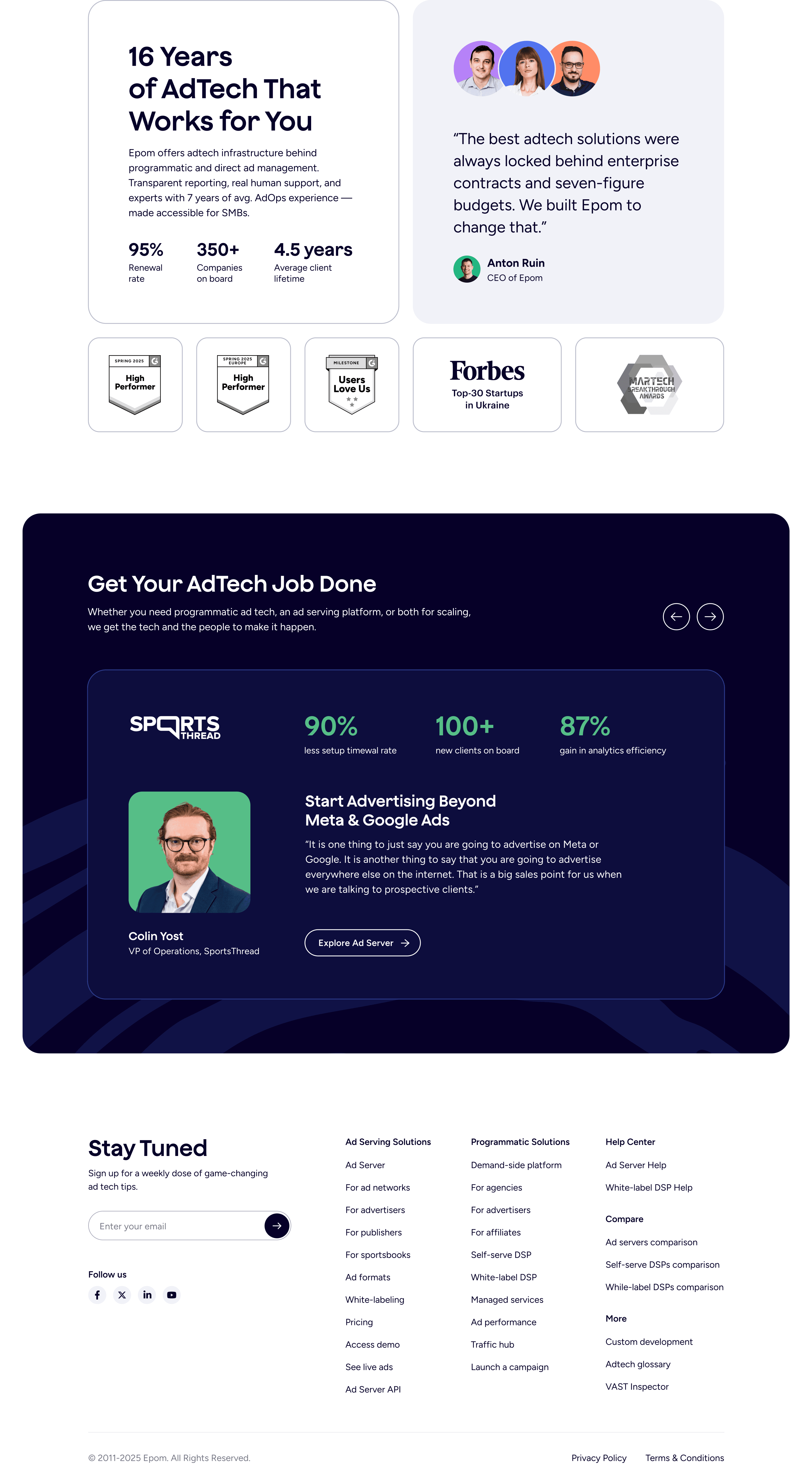
Refreshing the brand and building visual distinction between two products.
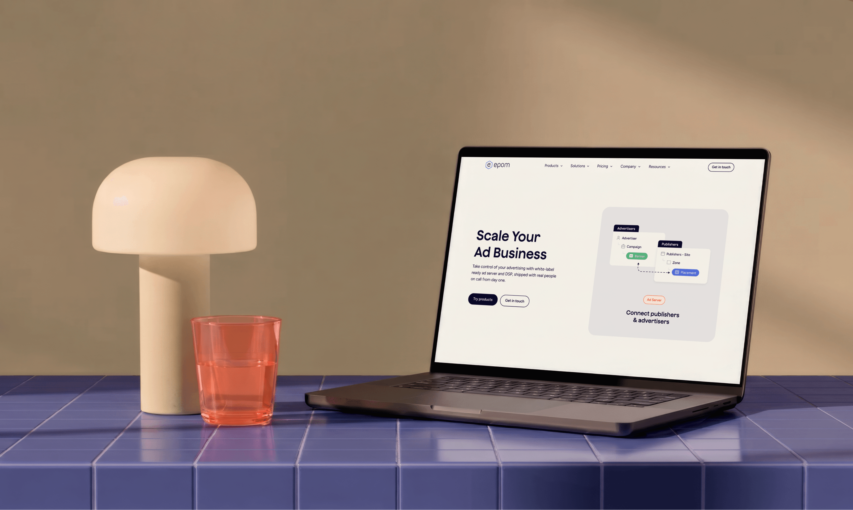
Epom is an ad tech platform for managing and serving digital ads. It offers two core products: an ad server for running and optimizing campaigns, and a DSP for programmatic media buying.
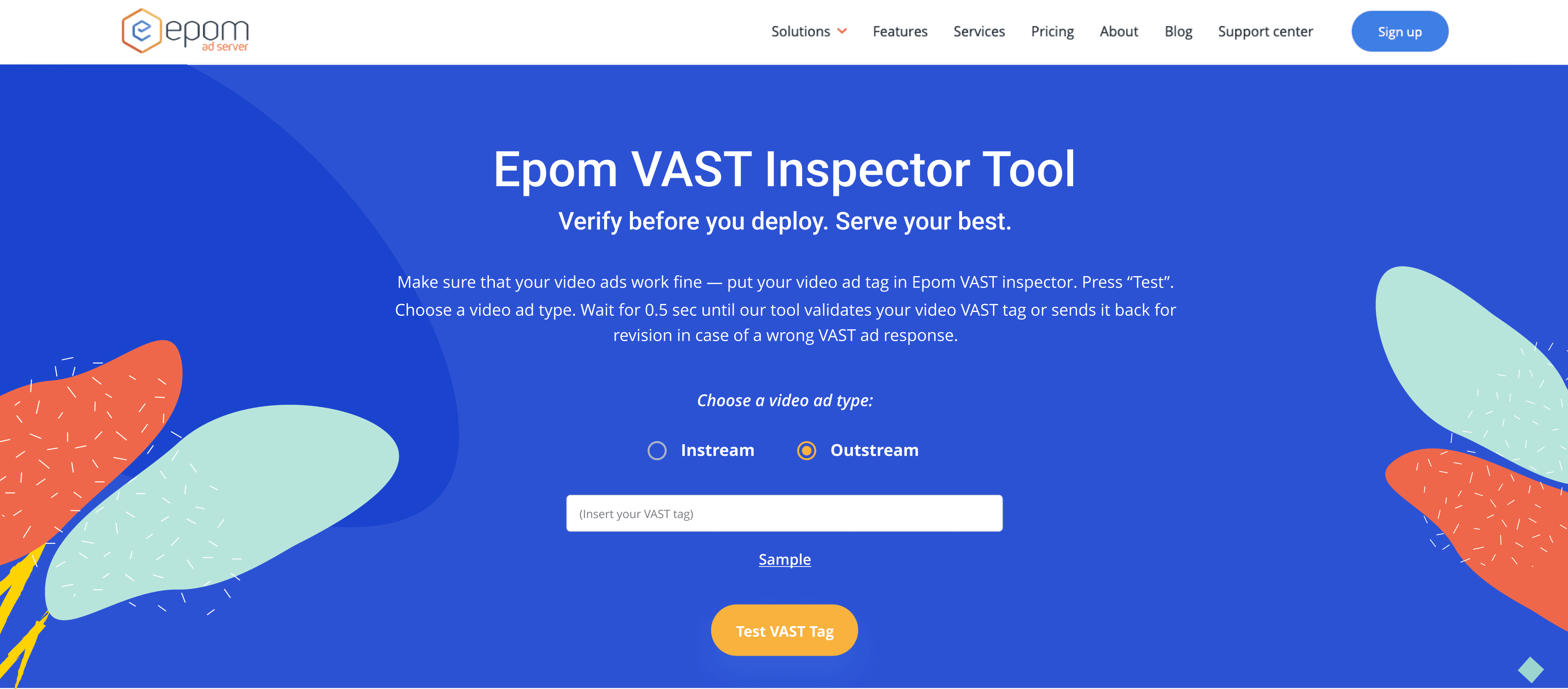
When I started working with Epom, the brand had no visual guidelines at all. Colors and styles varied across the website, ads, and marketing materials with no clear system behind them. The design felt outdated, and the website structure made it hard to understand what the company actually offered. The main page only covered the ad server, even though Epom had a second core product, the DSP. Some pages had broken flows and layout issues that had gone unnoticed.
The company was also shifting its positioning, rethinking how it presents and sells the product. They wanted to feel more approachable and make it clear what each product actually does for the client. The visuals needed to go in the same direction.

What the brand looked like before I joined the team
Before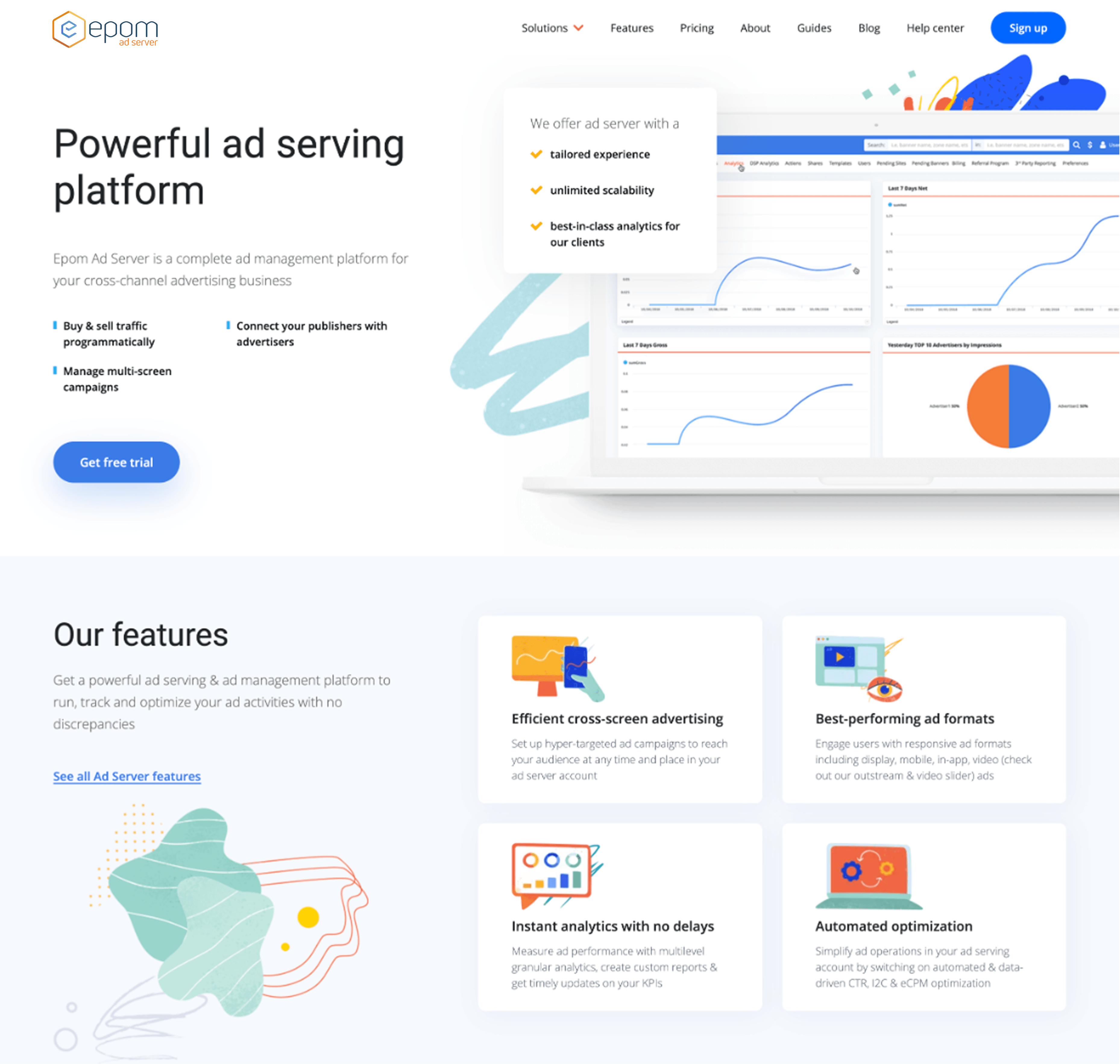



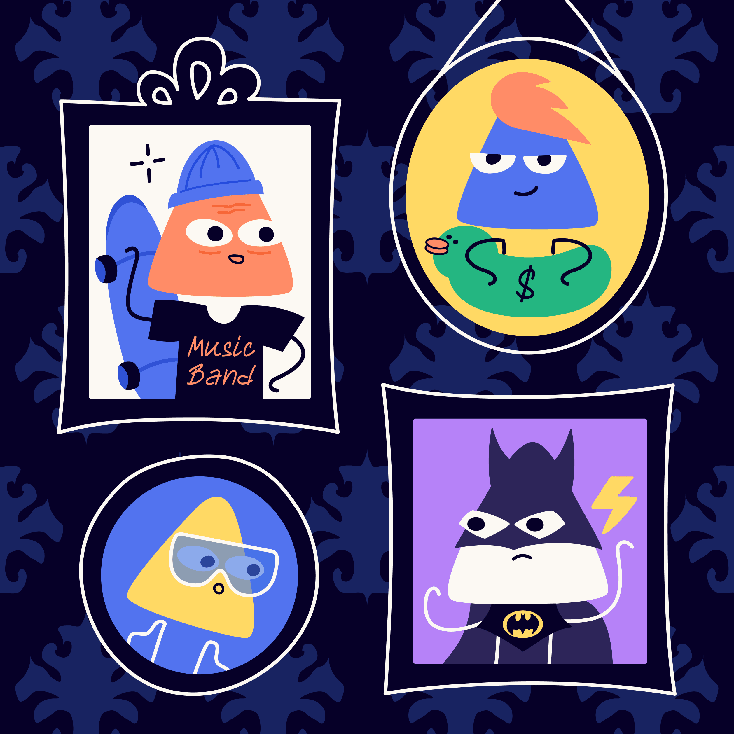
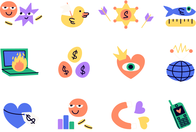
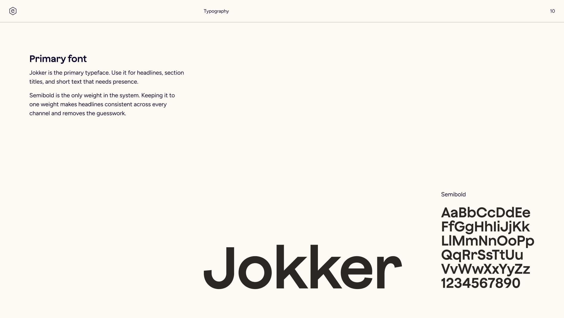
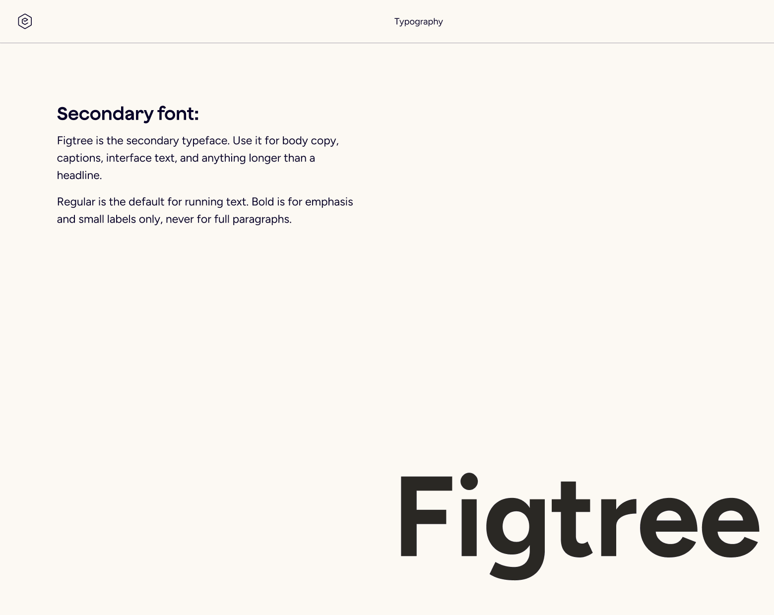
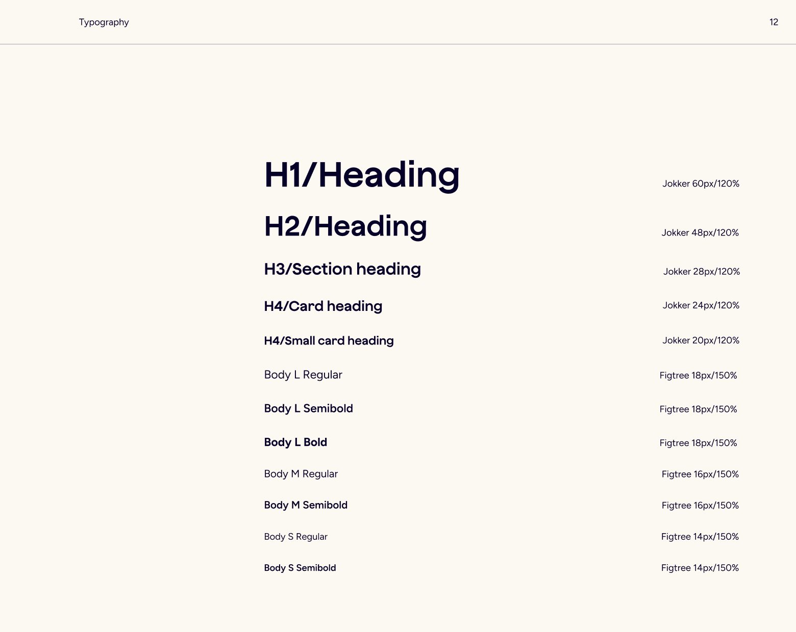
I started with the brand: refreshed the logo, picked a type pairing that matched the new positioning, and built a brand book the team could work from. Our illustrator developed the mascot and set the visual style for illustrations. We drew the first icon set together, and after that the designer on my team and I kept expanding it as new needs came up.
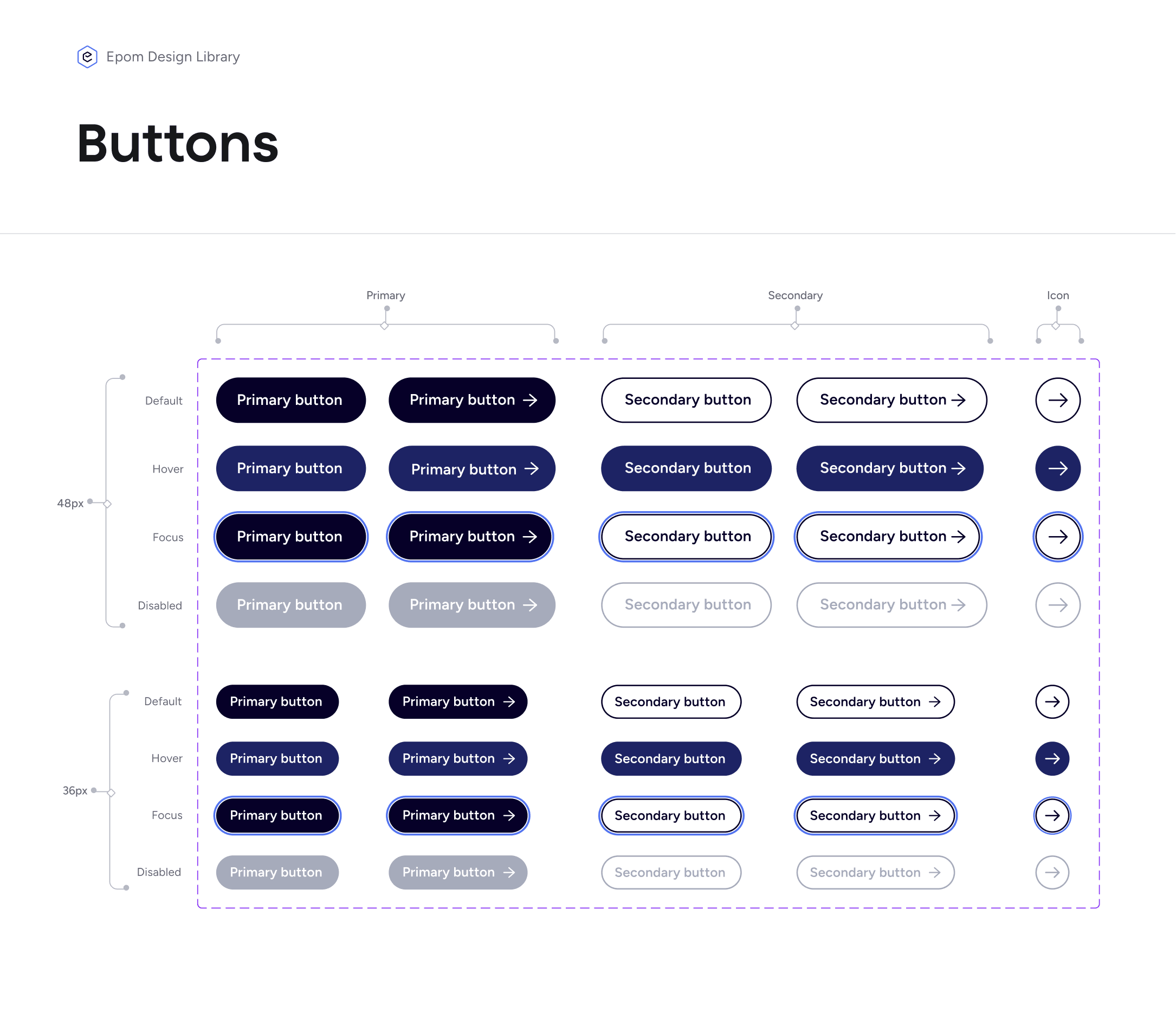
I also built a small library of elements for the website and marketing materials: colors, typography, buttons, and the components the team used most often. The idea was to give everyone a shared starting point instead of rebuilding the same things from scratch.
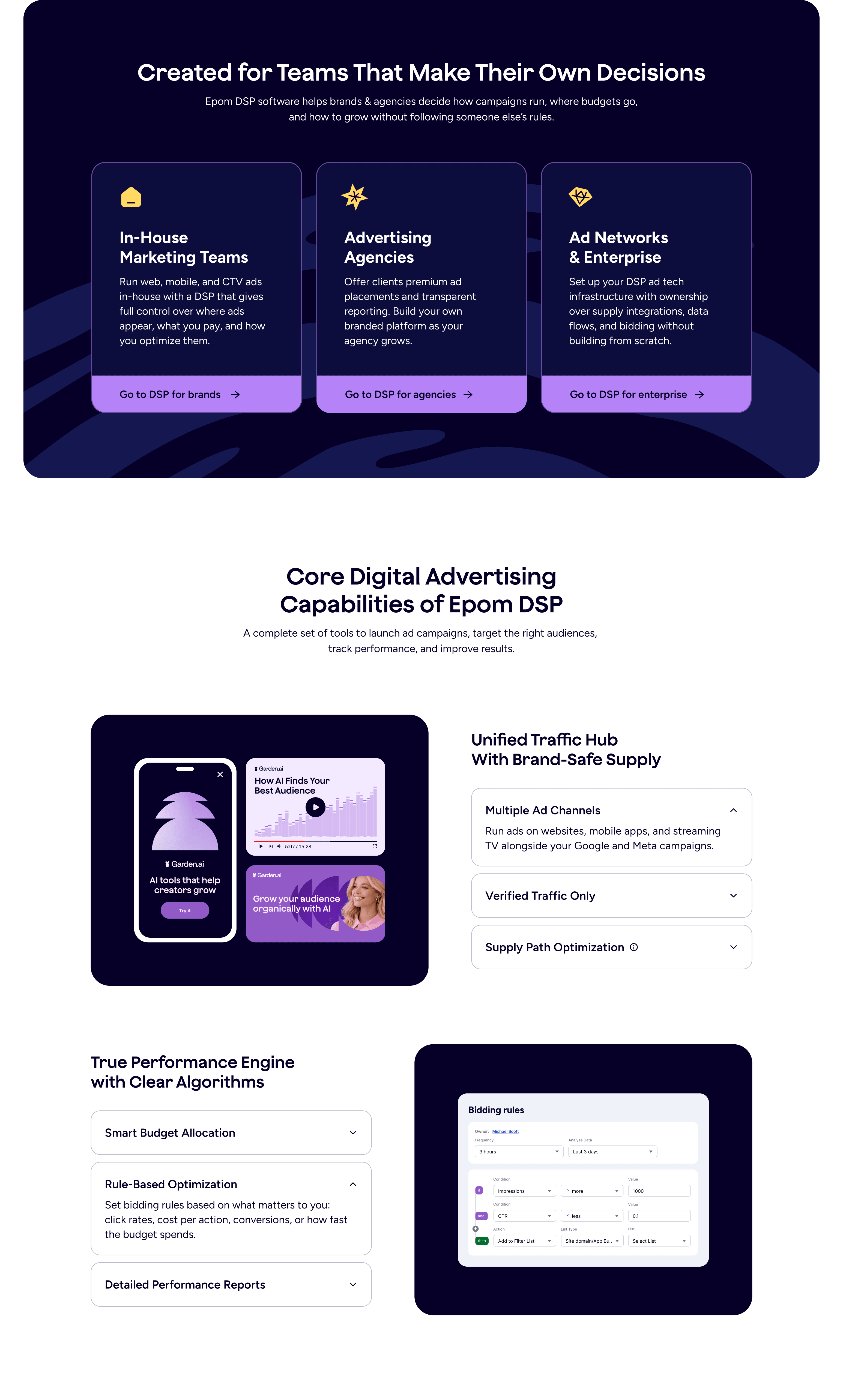
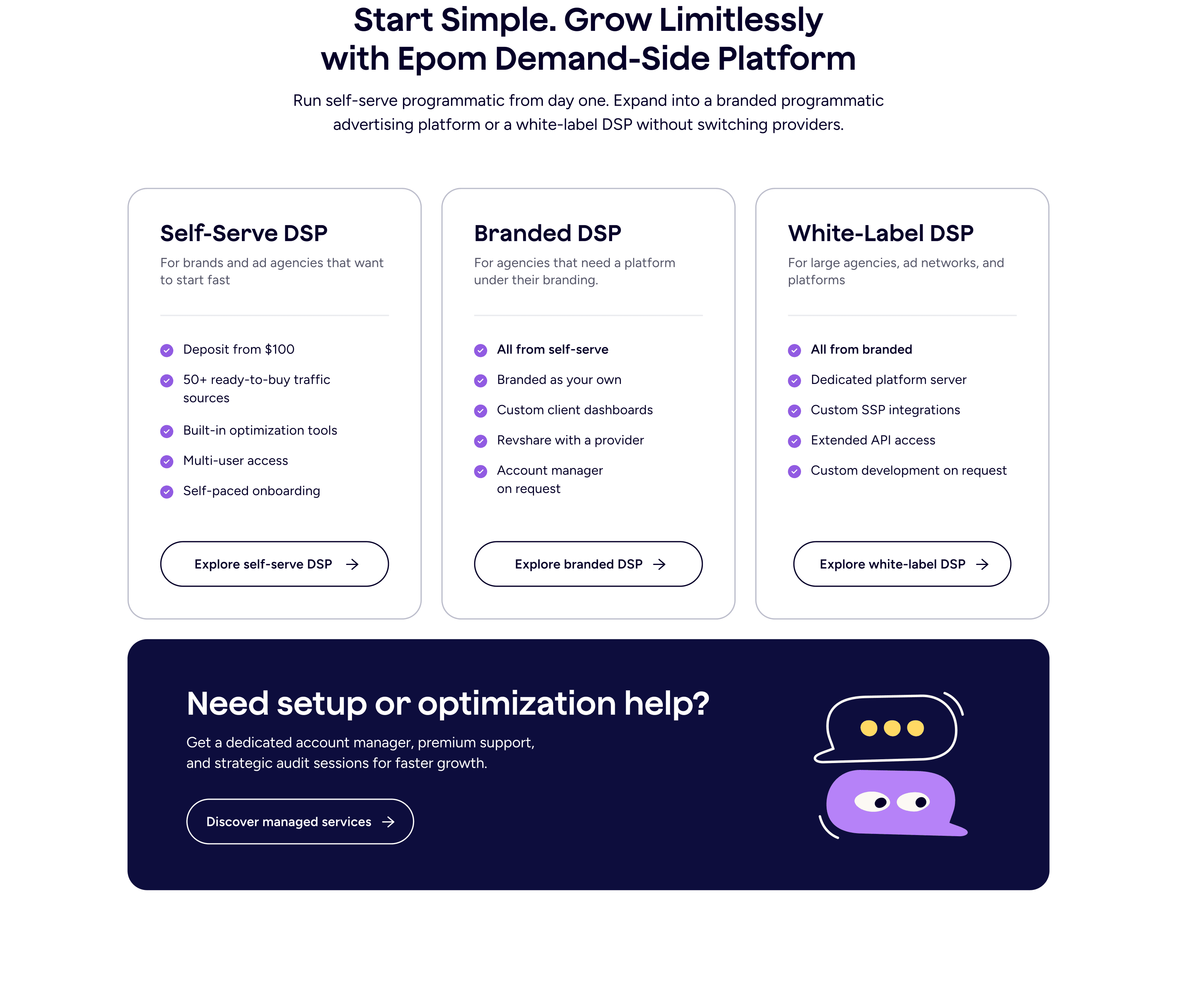
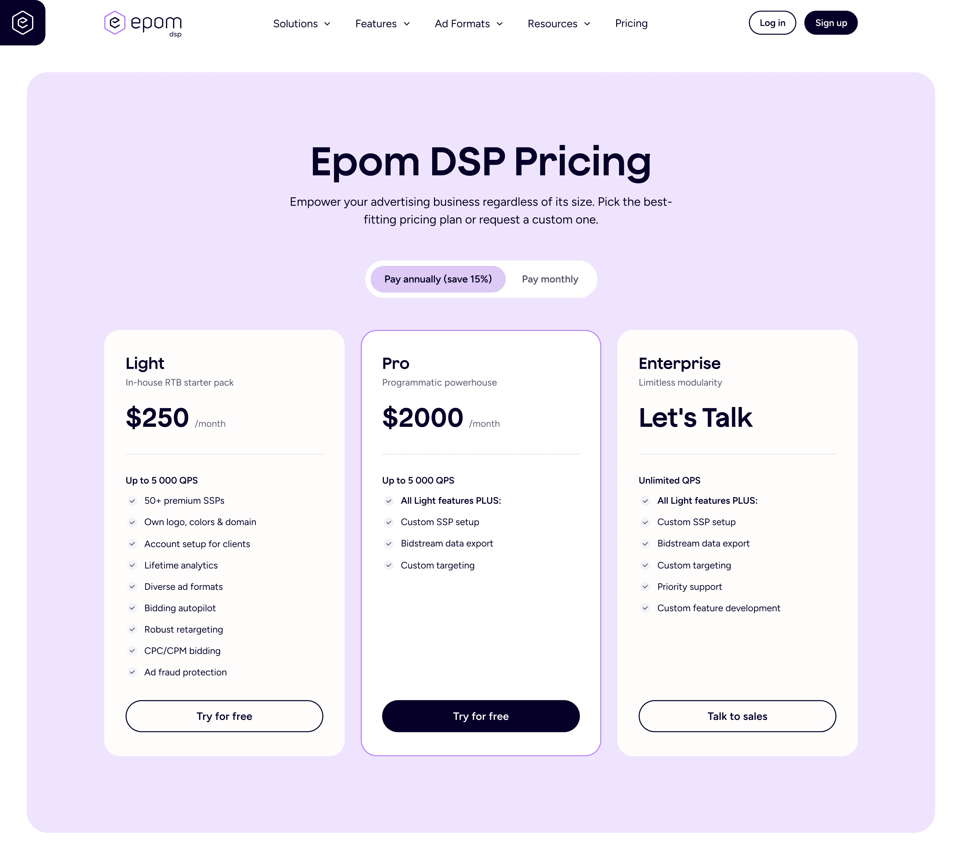
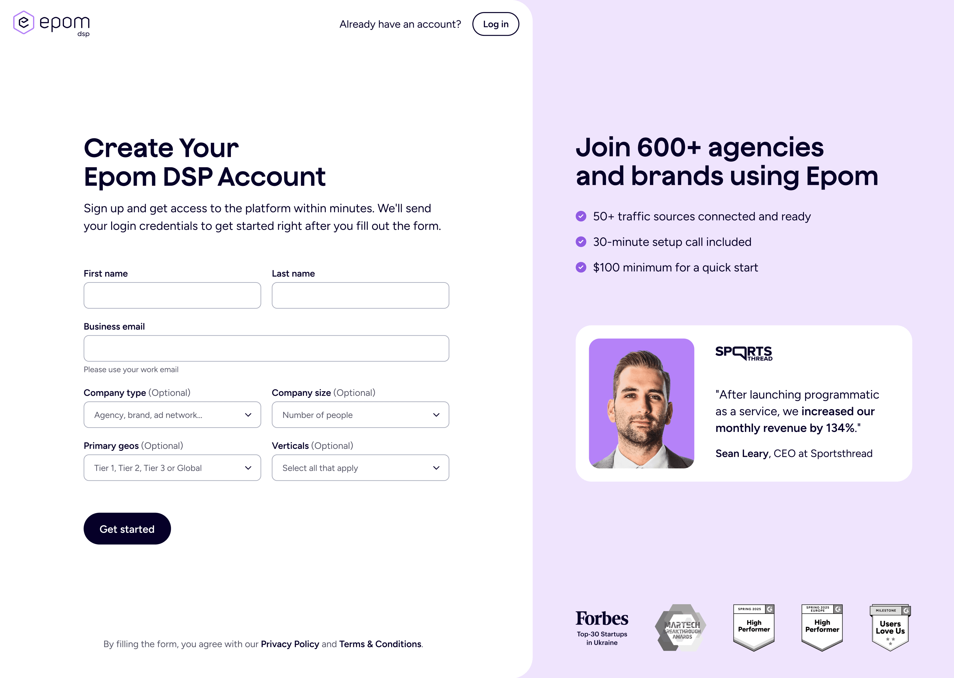
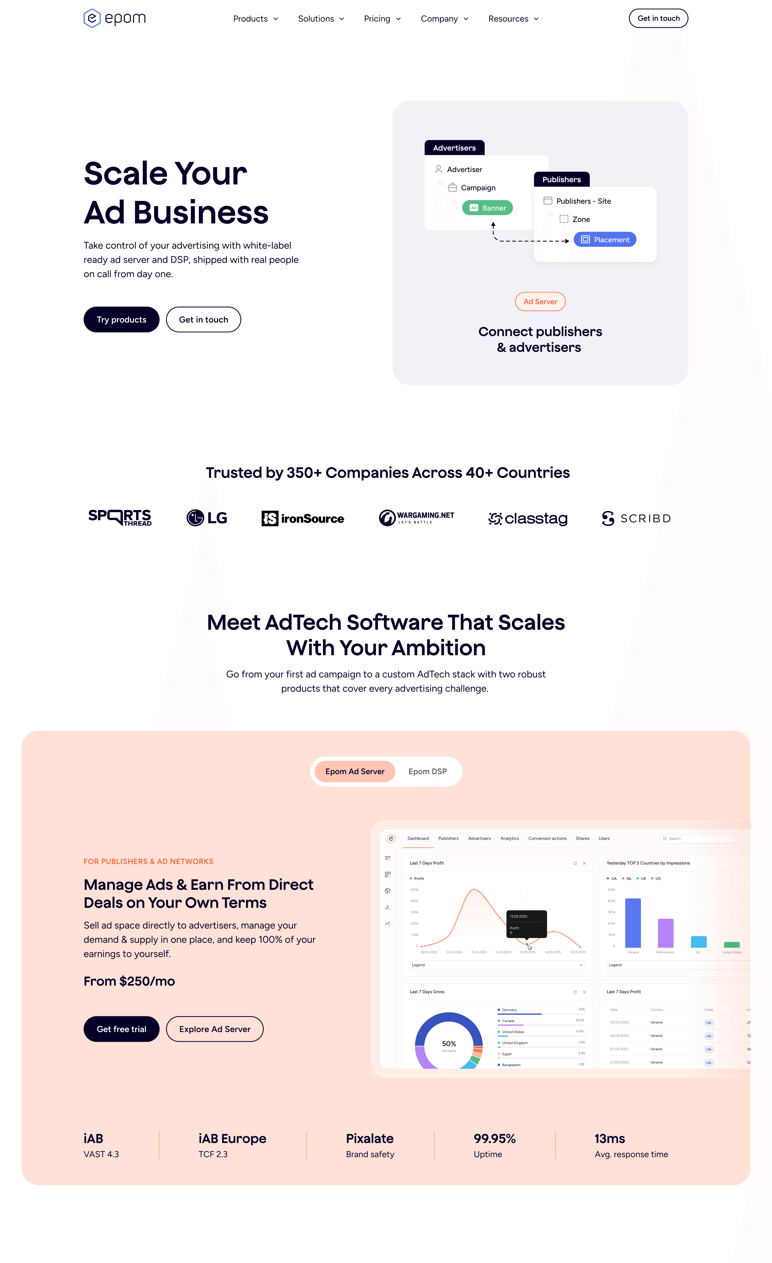
The website needed structural work, so I went through the whole site and built a new sitemap. Before that, the homepage only talked about the ad server, so half the business was invisible to anyone landing on the site. The new structure gave the company its own homepage that briefly introduces Epom and both products, with a clear path into a dedicated section for each one where visitors could get into the details. After that we redesigned the feature pages, pricing, and blog, and set the visual direction for banners, emails, blog images, social, and ads.
The company wasn’t ready for a full logo redesign, so I proposed a refresh instead: keep the shape people already knew, and fix what wasn’t working underneath.
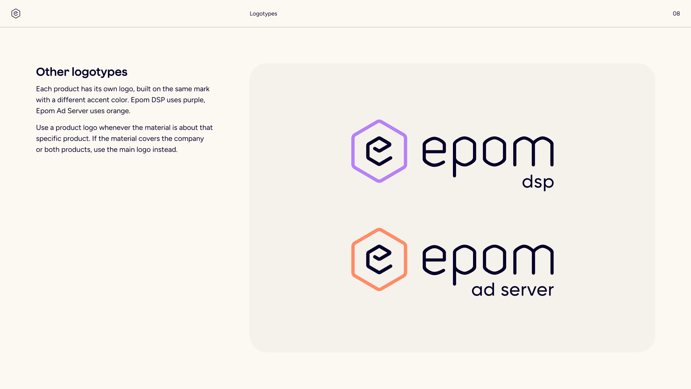
Each product already had its own color on the hexagon, so the logic was in place. What changed was how it was applied. The gradients came off, and the symbol inside the mark went from brand blue to a neutral dark, so the product color could do the work on its own. I redrew the letterforms to even out the stroke weight, and rebuilt the proportions and spacing on a grid so the mark and the wordmark read as one object. The shapes also became rounder and softer, which fit the friendlier direction the brand was moving toward.
There was also no logo for Epom as a company. Every version belonged to a specific product, so there was nothing to use when the company needed to speak for itself. I added one, and gave it the brand blue so it sat alongside the products without competing with them.






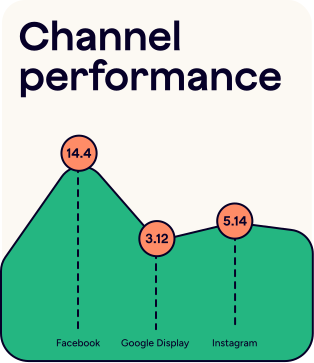
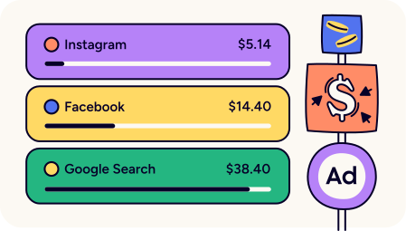
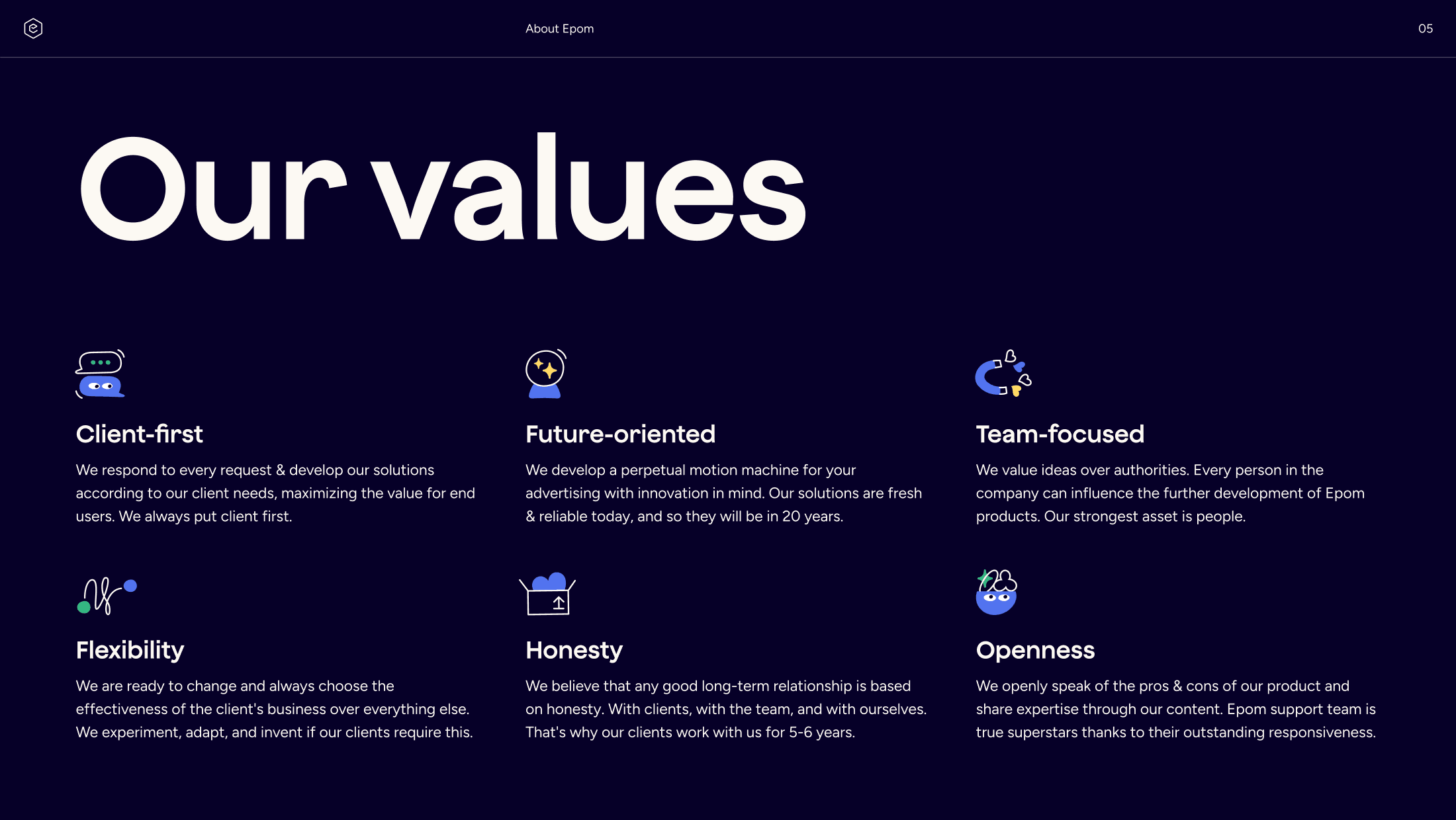
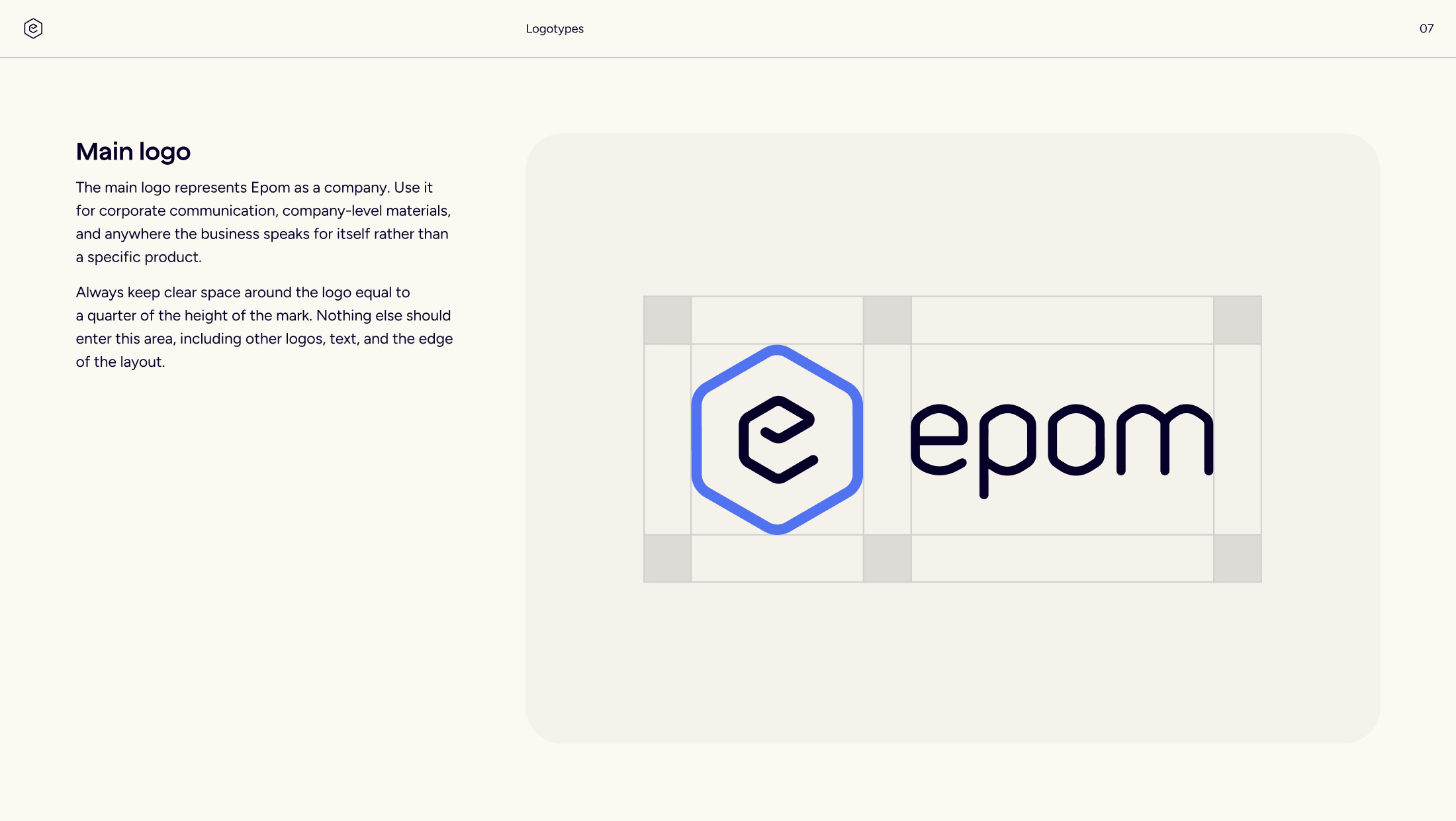
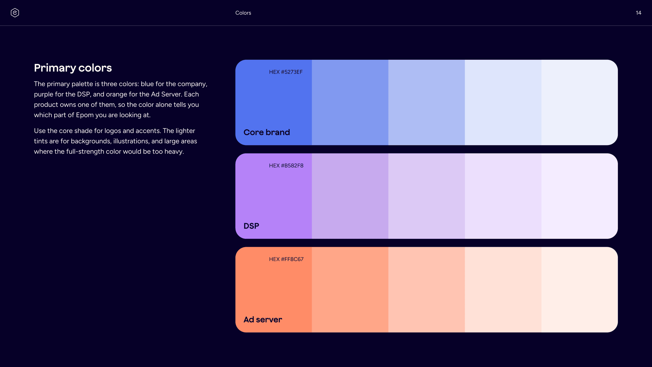
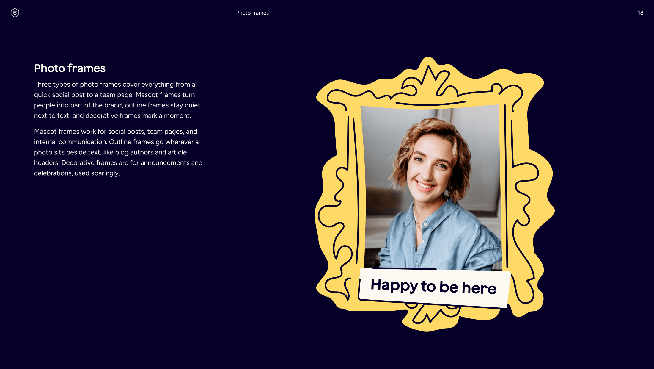


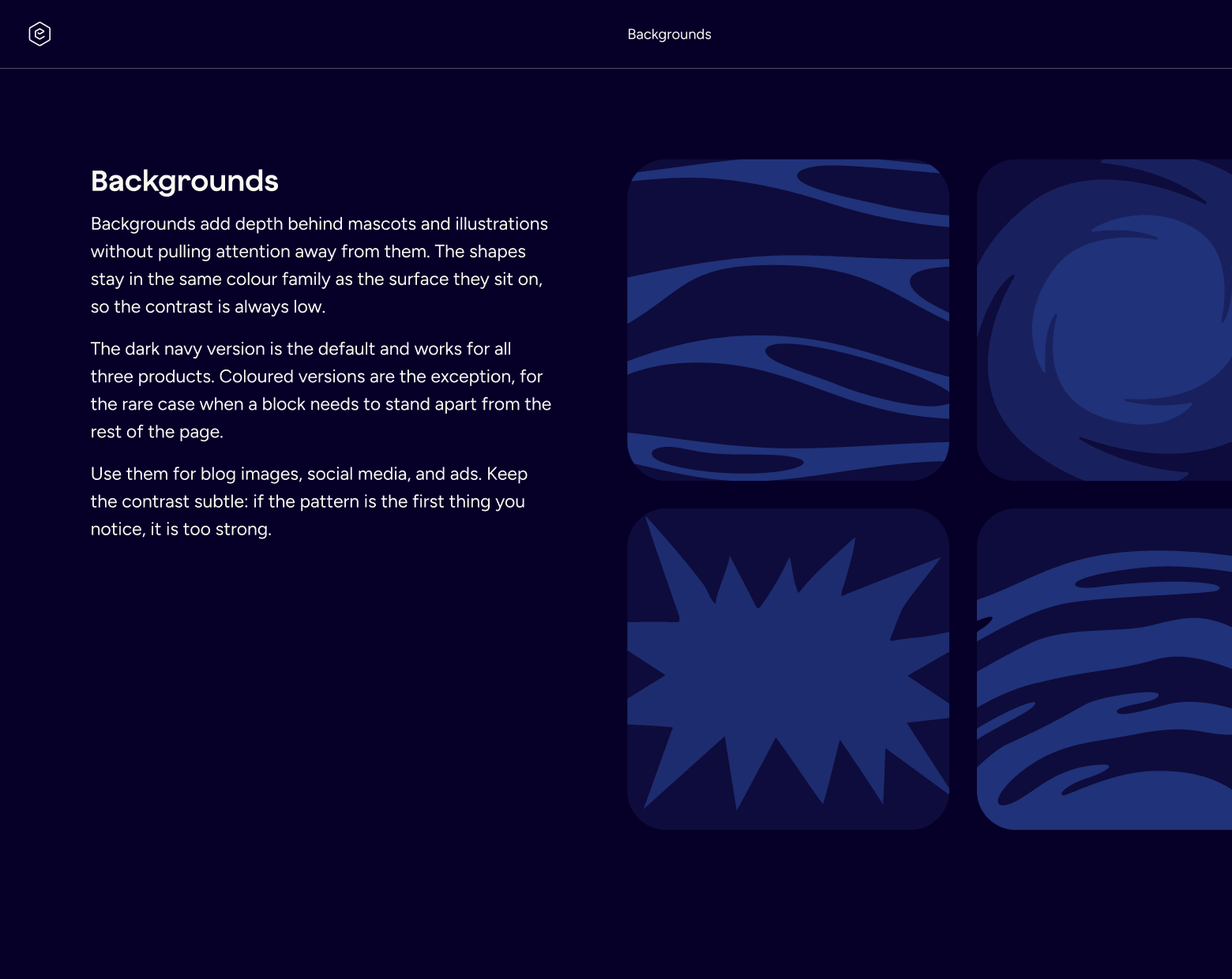
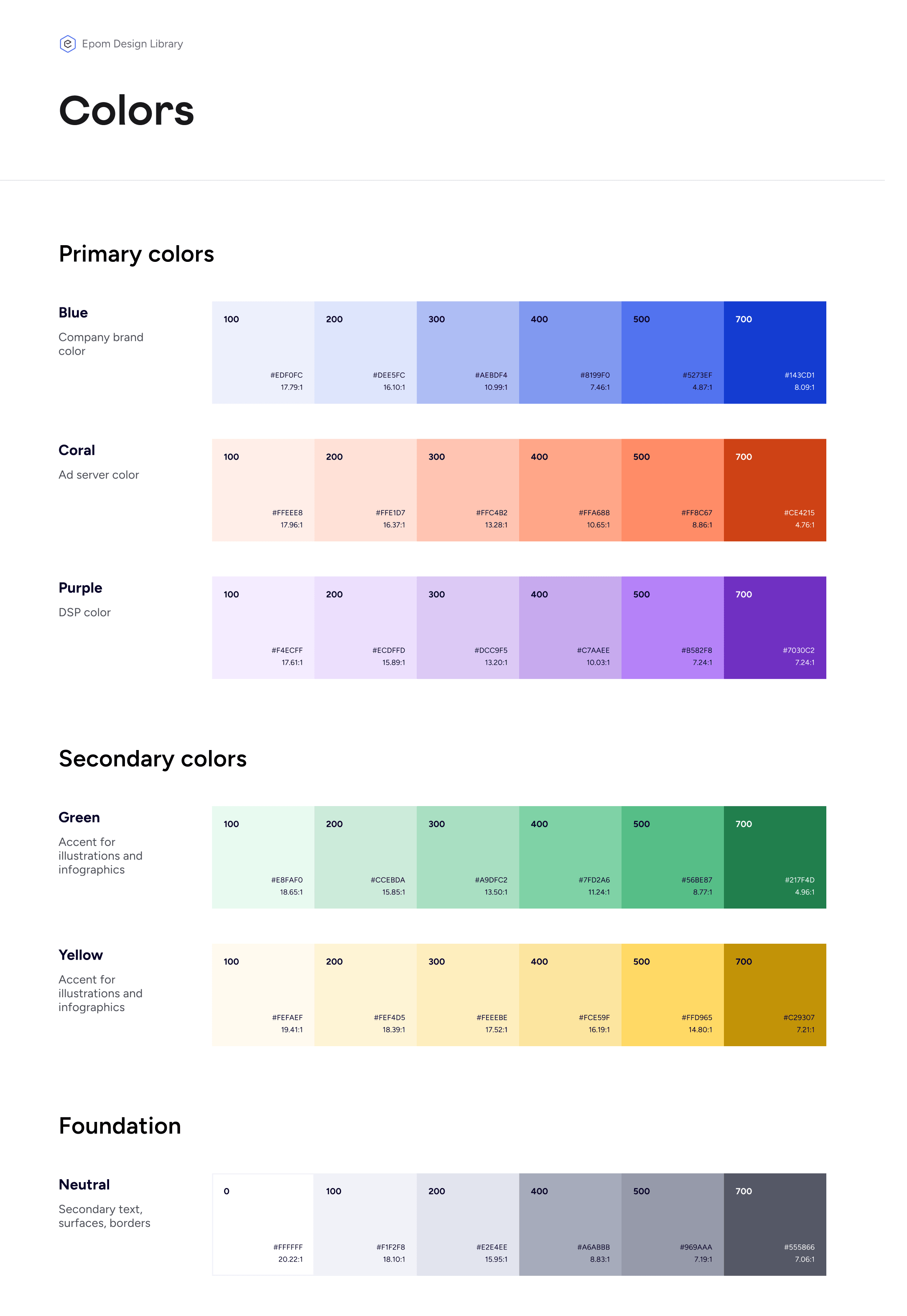
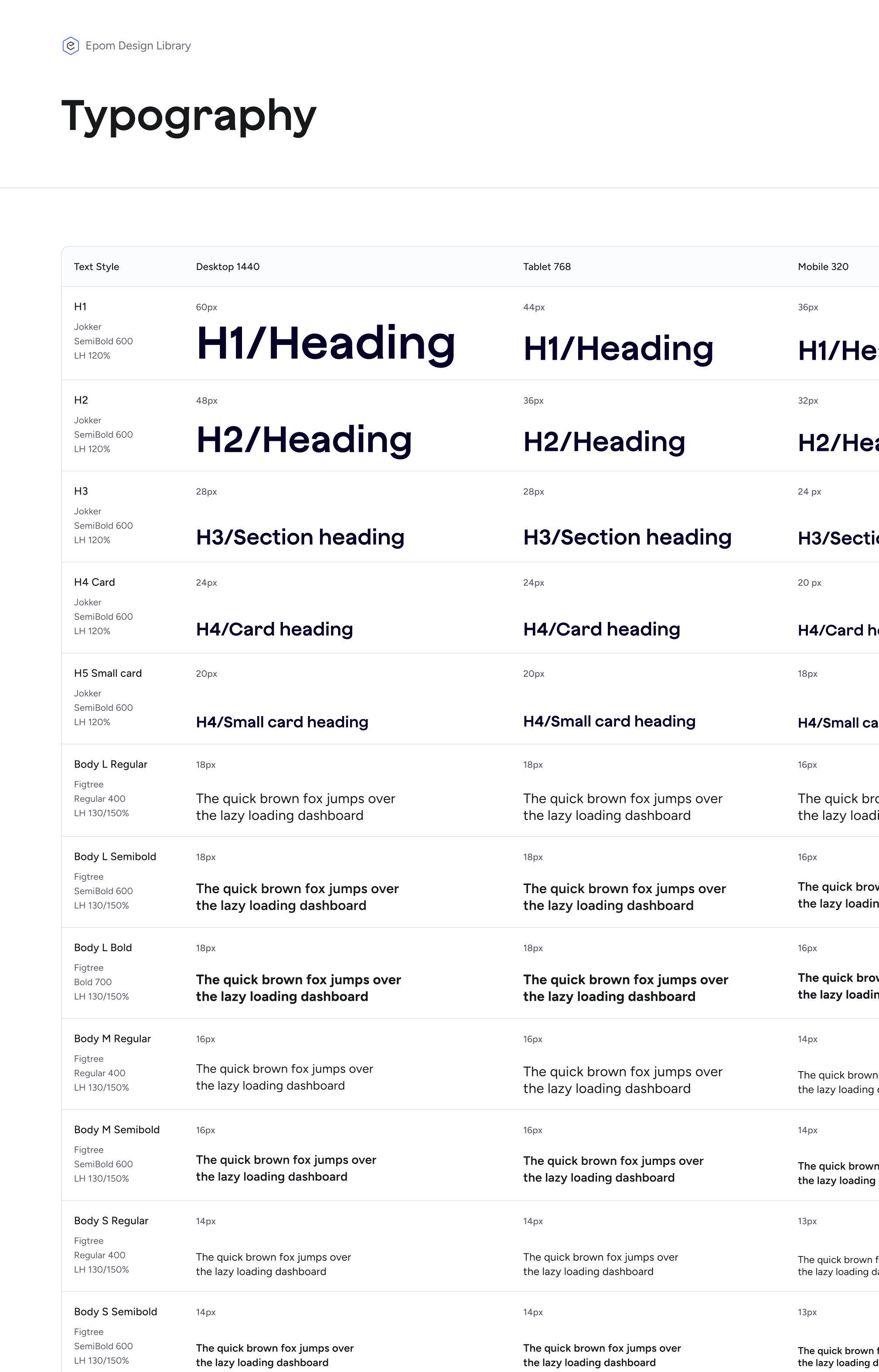
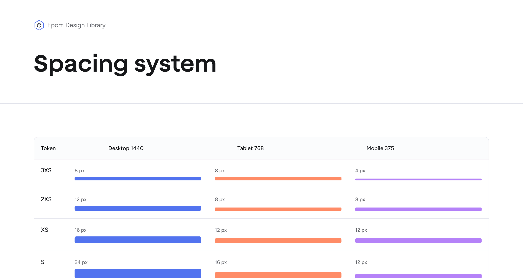
Before the redesign, Epom sold two products and showed one. The homepage covered the ad server only, so anyone arriving with a programmatic need had no way to find the DSP. The new structure gives each product its own section, its own entry point, and its own colour, while the homepage introduces the company instead of a single product.
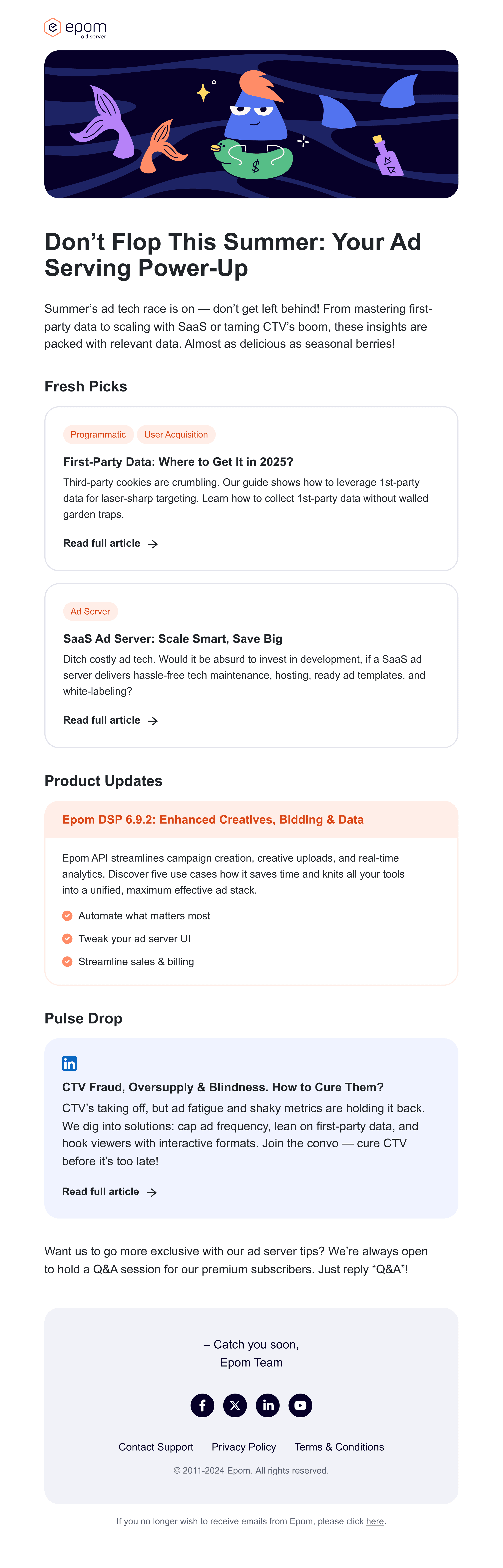
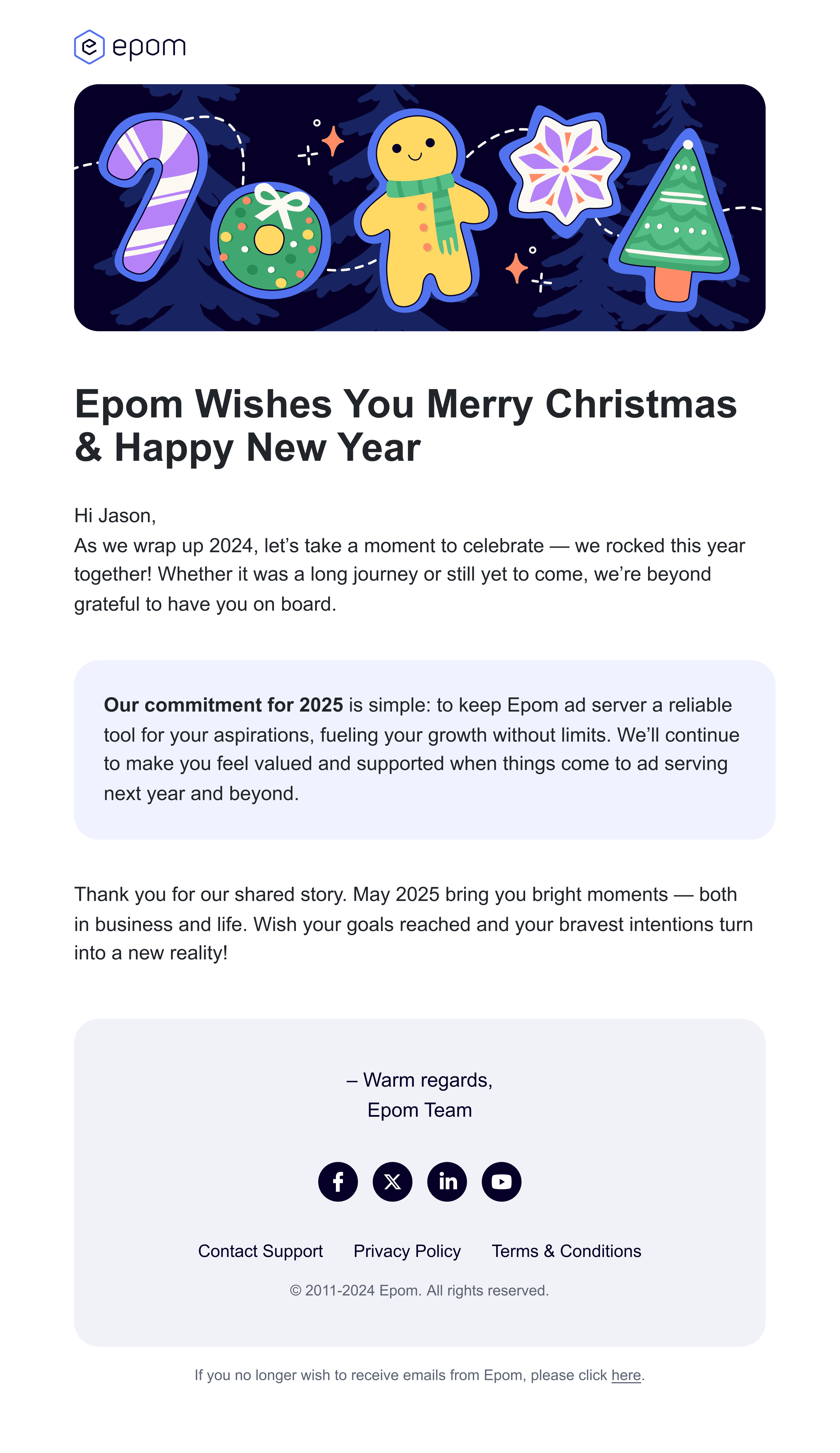
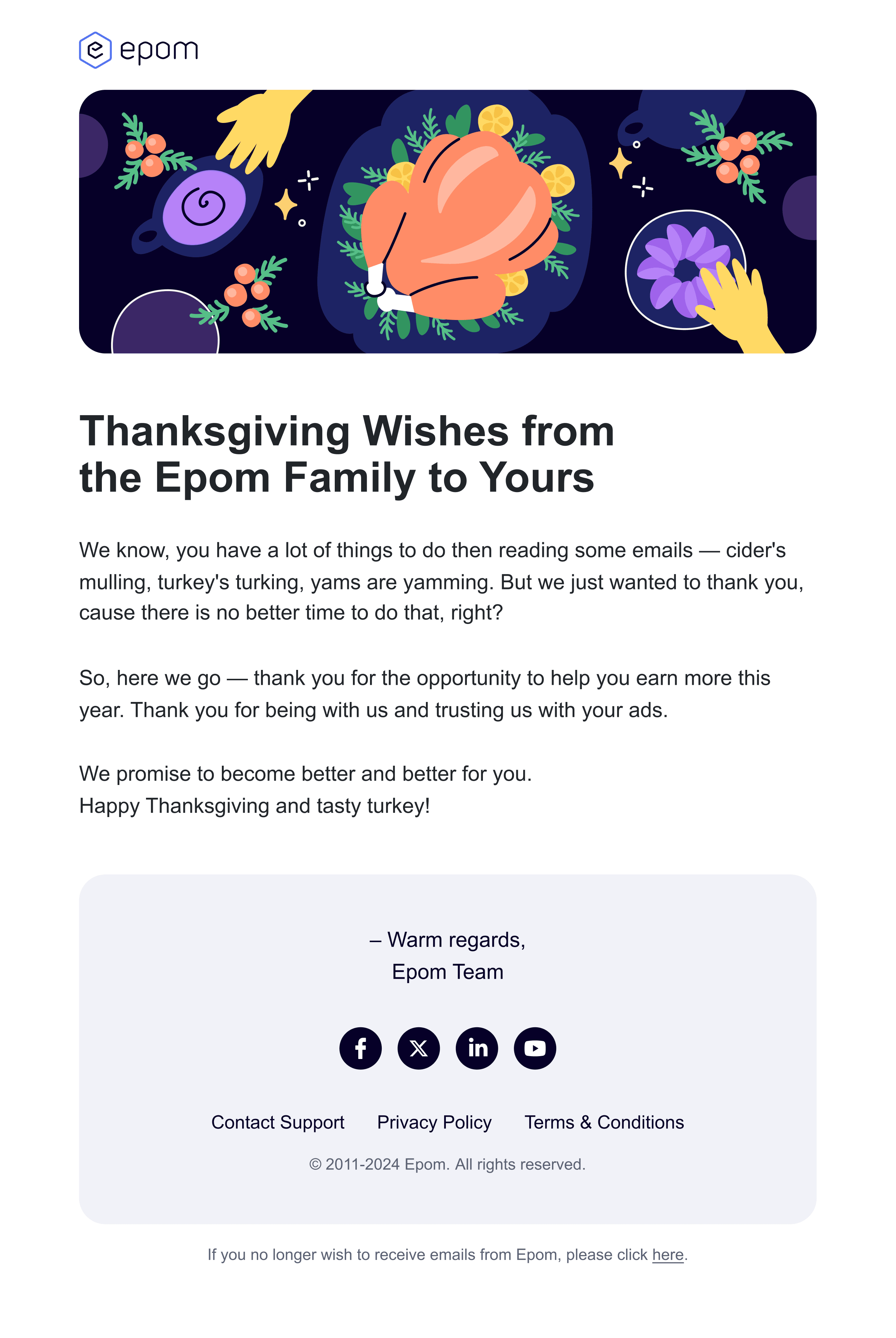
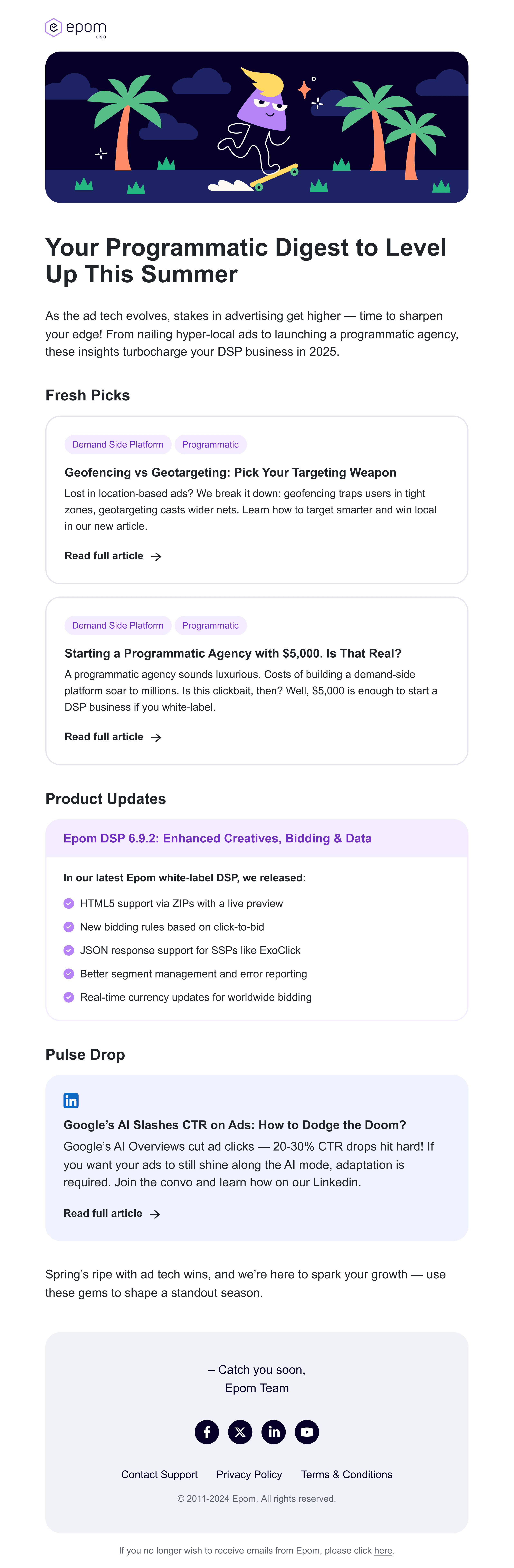
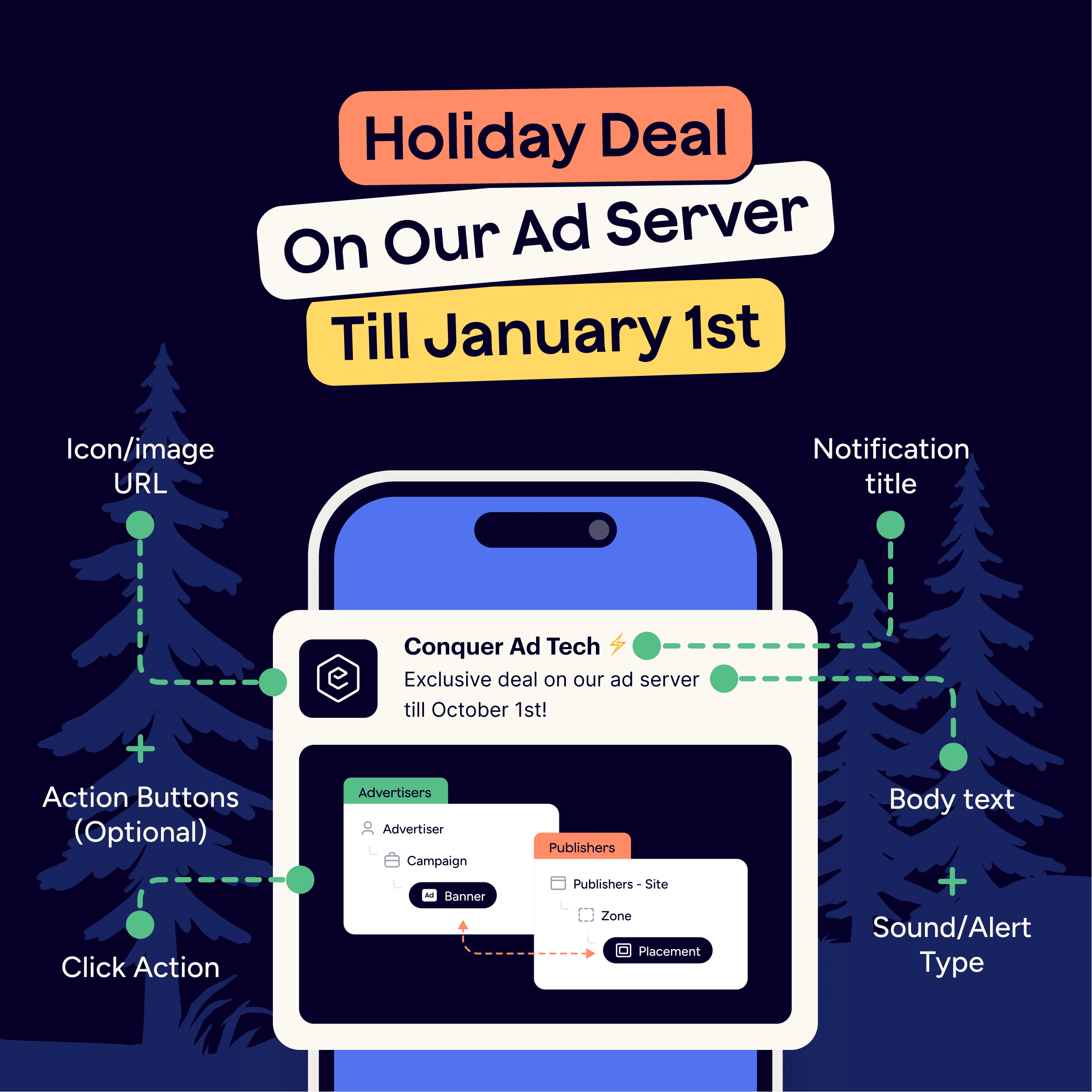
The same system runs through the website, blog, emails, ads, and social. Every channel now looks like it belongs to the same company. Before the refresh, the brand could do neither.
The team came out with a brand book and a design library covering typography, grids and spacing, colour, components, and templates. Pages and campaigns stopped drifting apart from each other, and designers could put on-brand work together much faster than before.