A brand refresh across web, ads, and social.
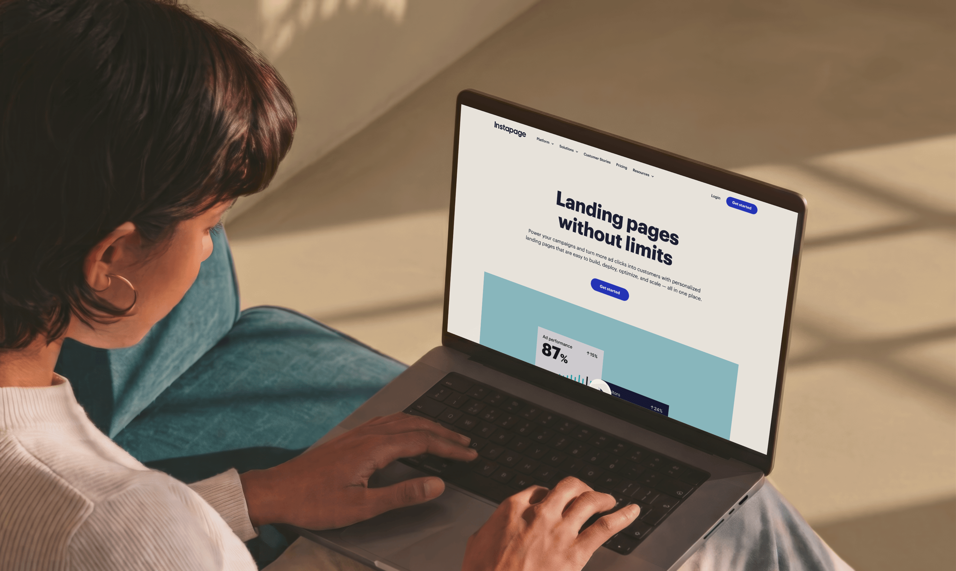
Instapage is a landing page platform for marketing teams. It lets them build, test, and optimize pages for paid campaigns without relying on developers every time something needs to change.
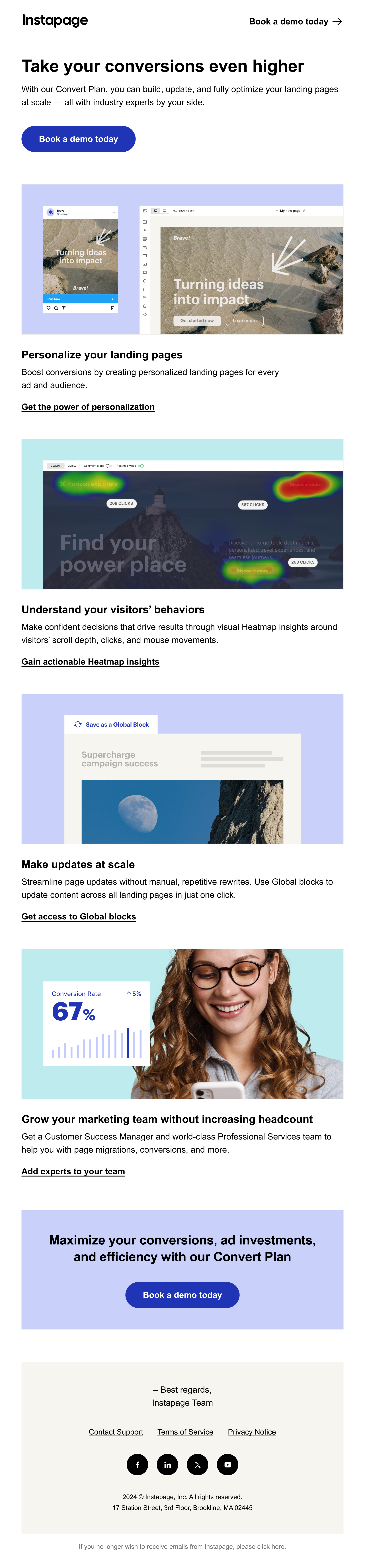
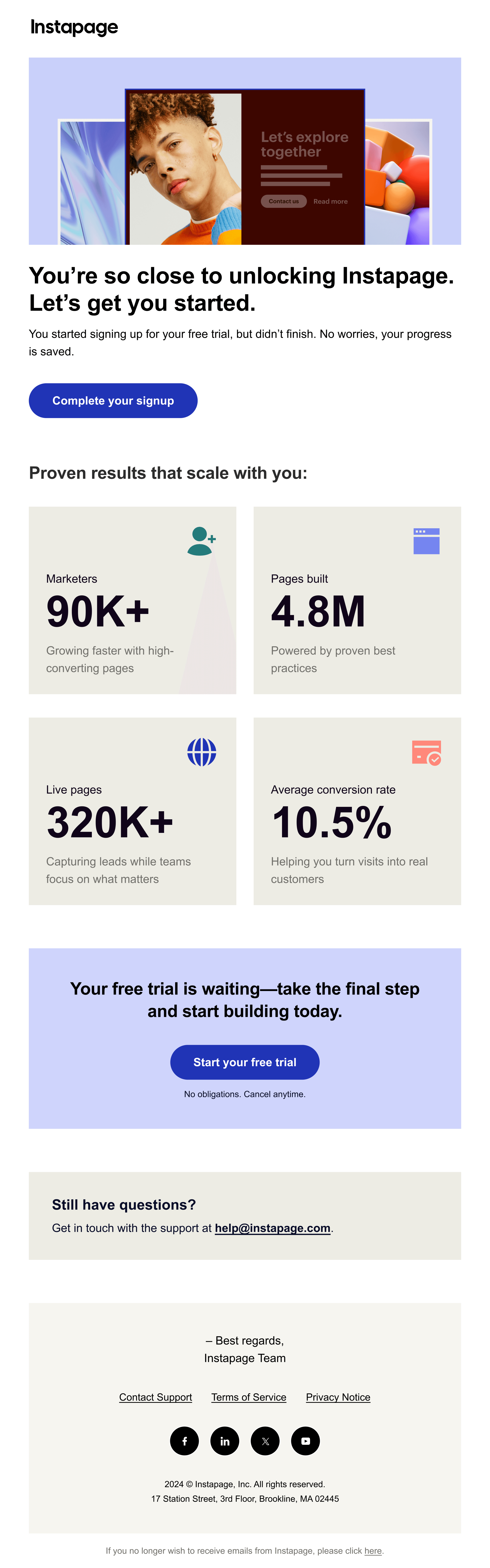
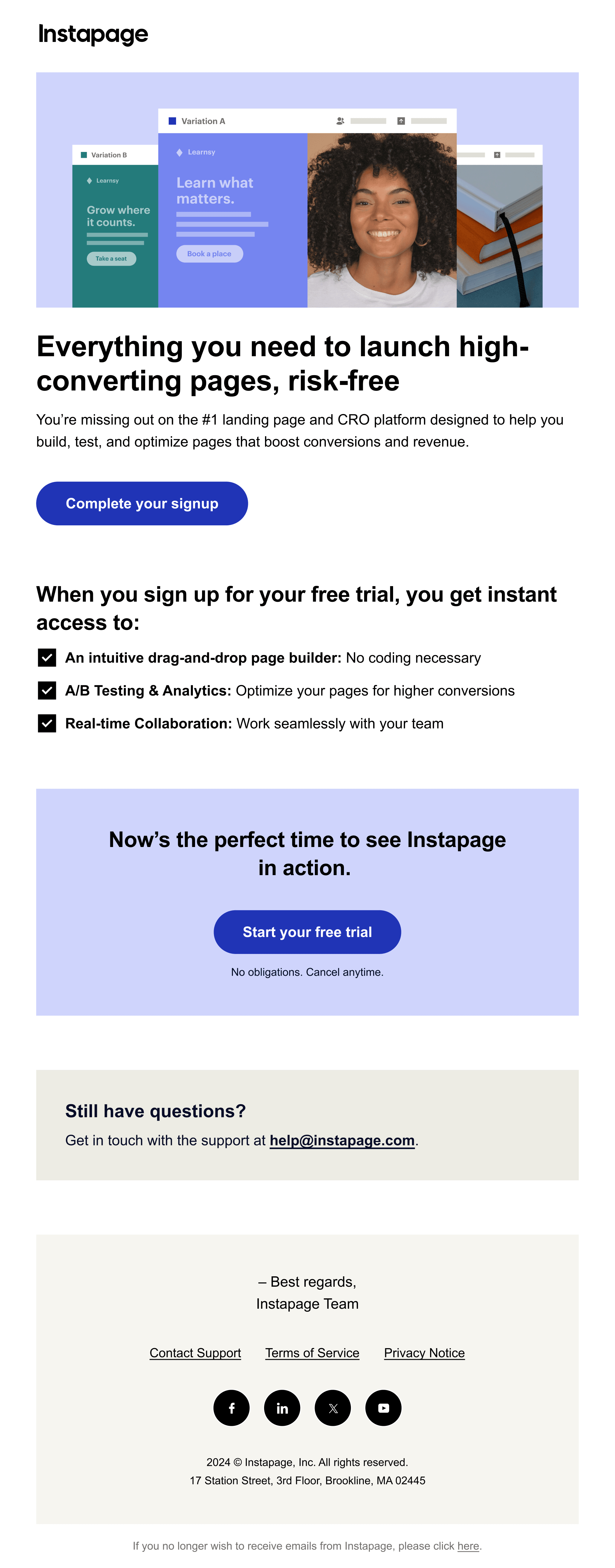
When I joined Instapage, there was already a brand guide in place, but it was outdated and covered only the basics, not enough to support a growing product and marketing team. Over time, different pages, emails, and campaigns each went their own visual direction. Even individual website pages started looking different from one another.
My focus was on bringing consistency across all touchpoints and building a visual foundation that was clear, flexible, and easy to work with, so the brand would look the same across every channel.

What the brand looked like before I joined the team
Before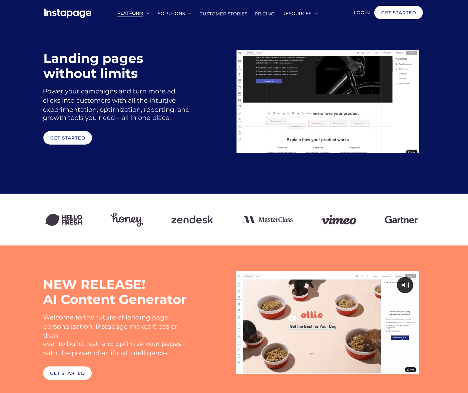




_.png&w=3840&q=90)
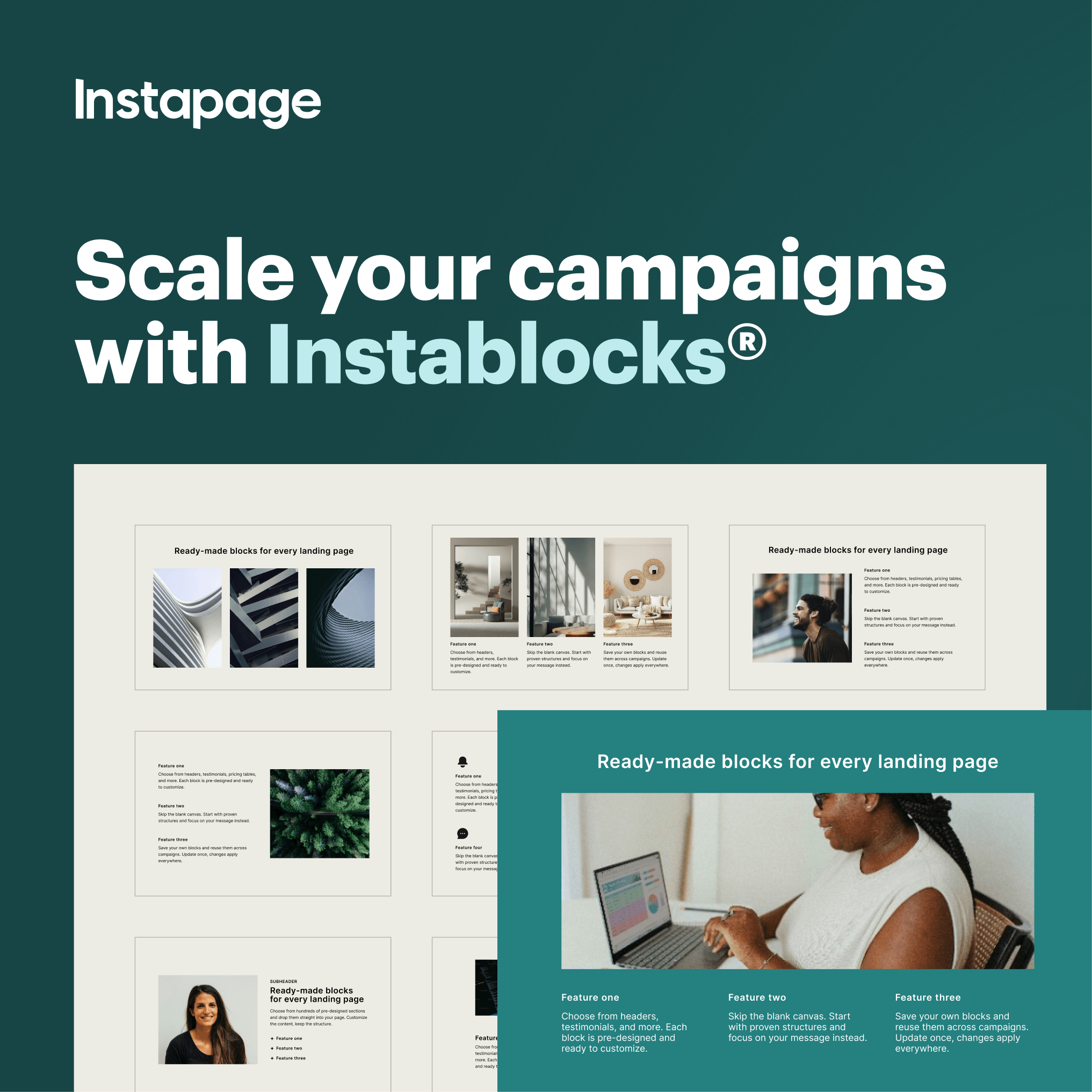
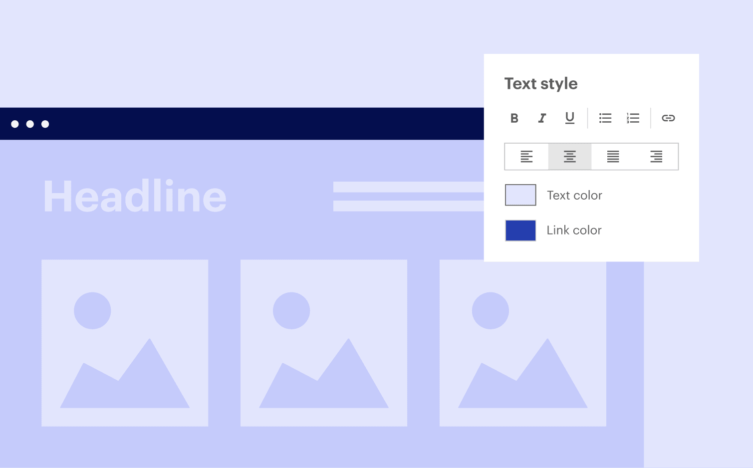
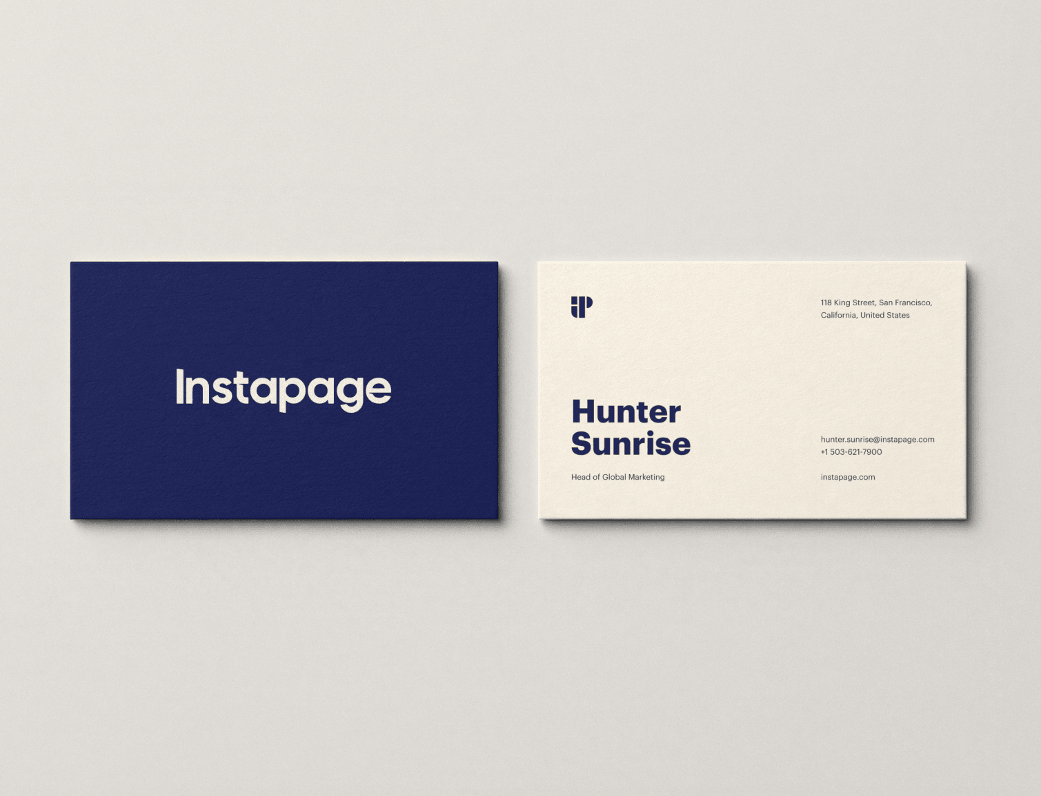
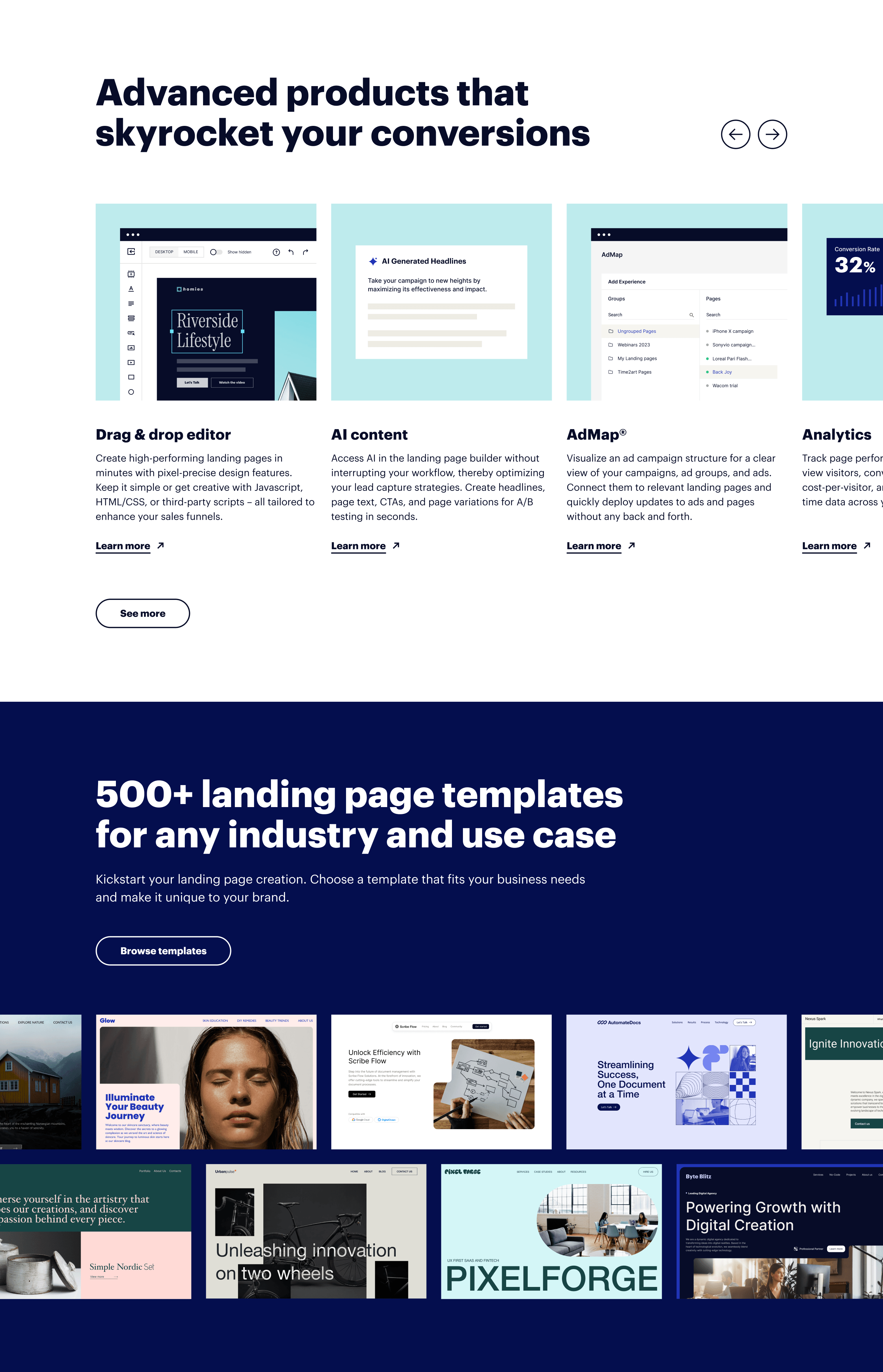
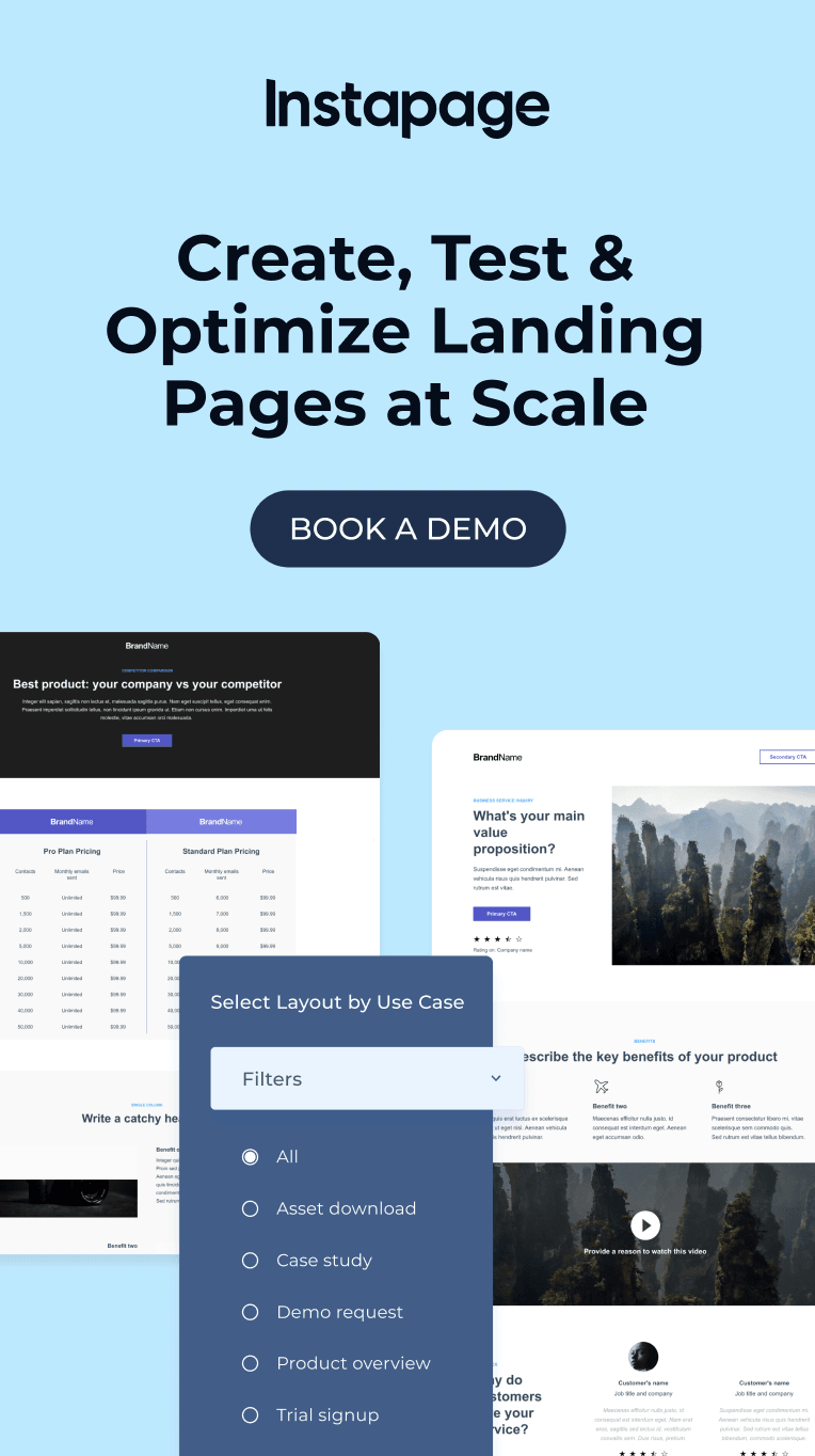
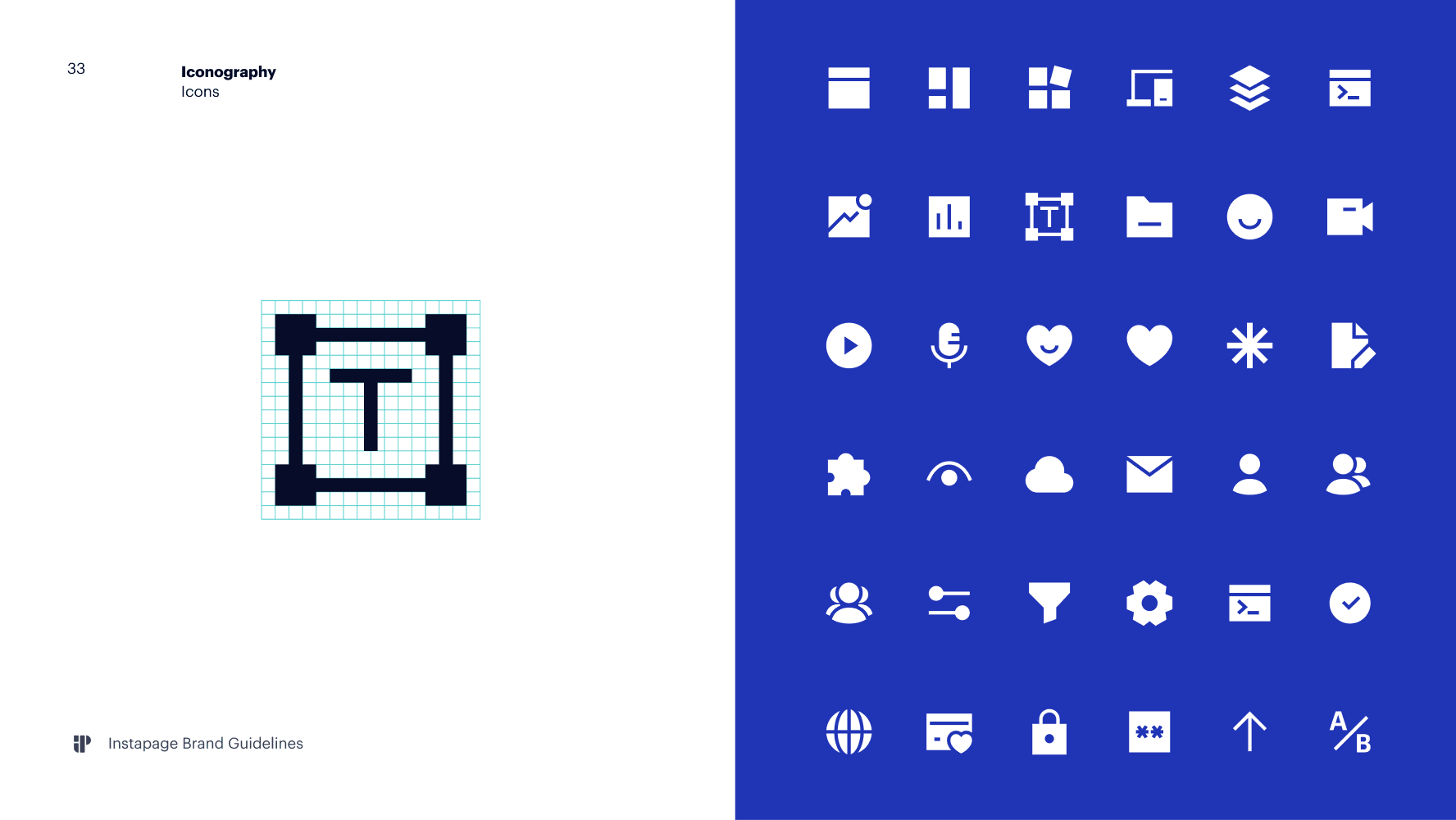
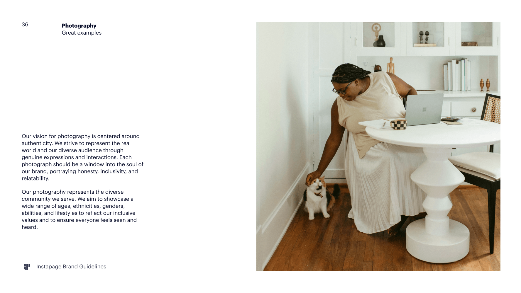
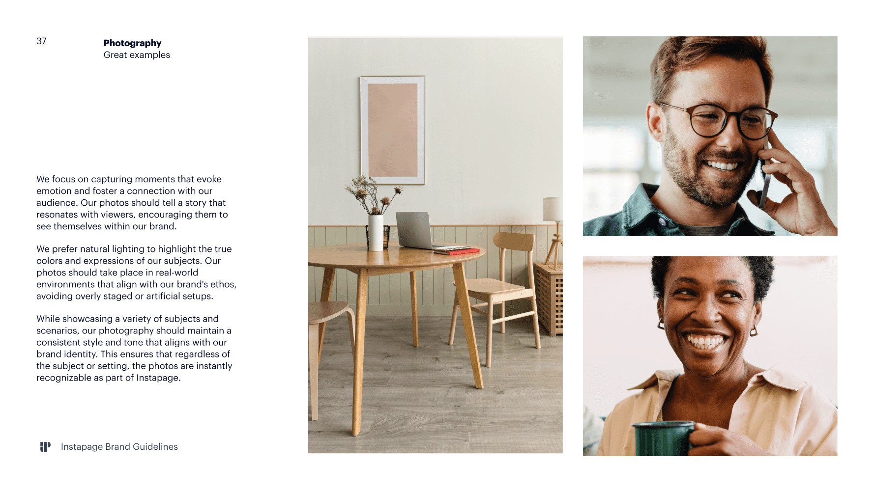
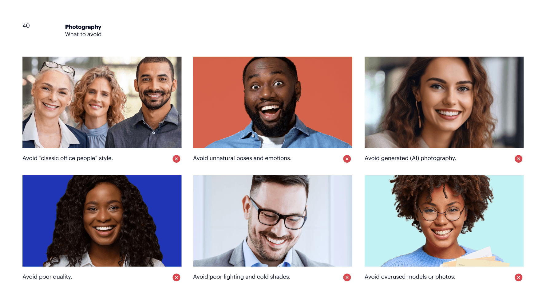
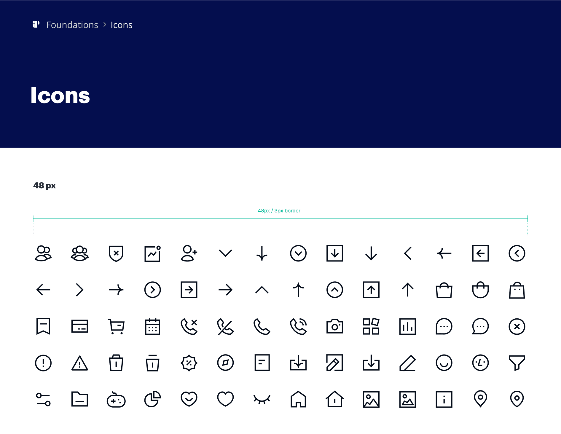
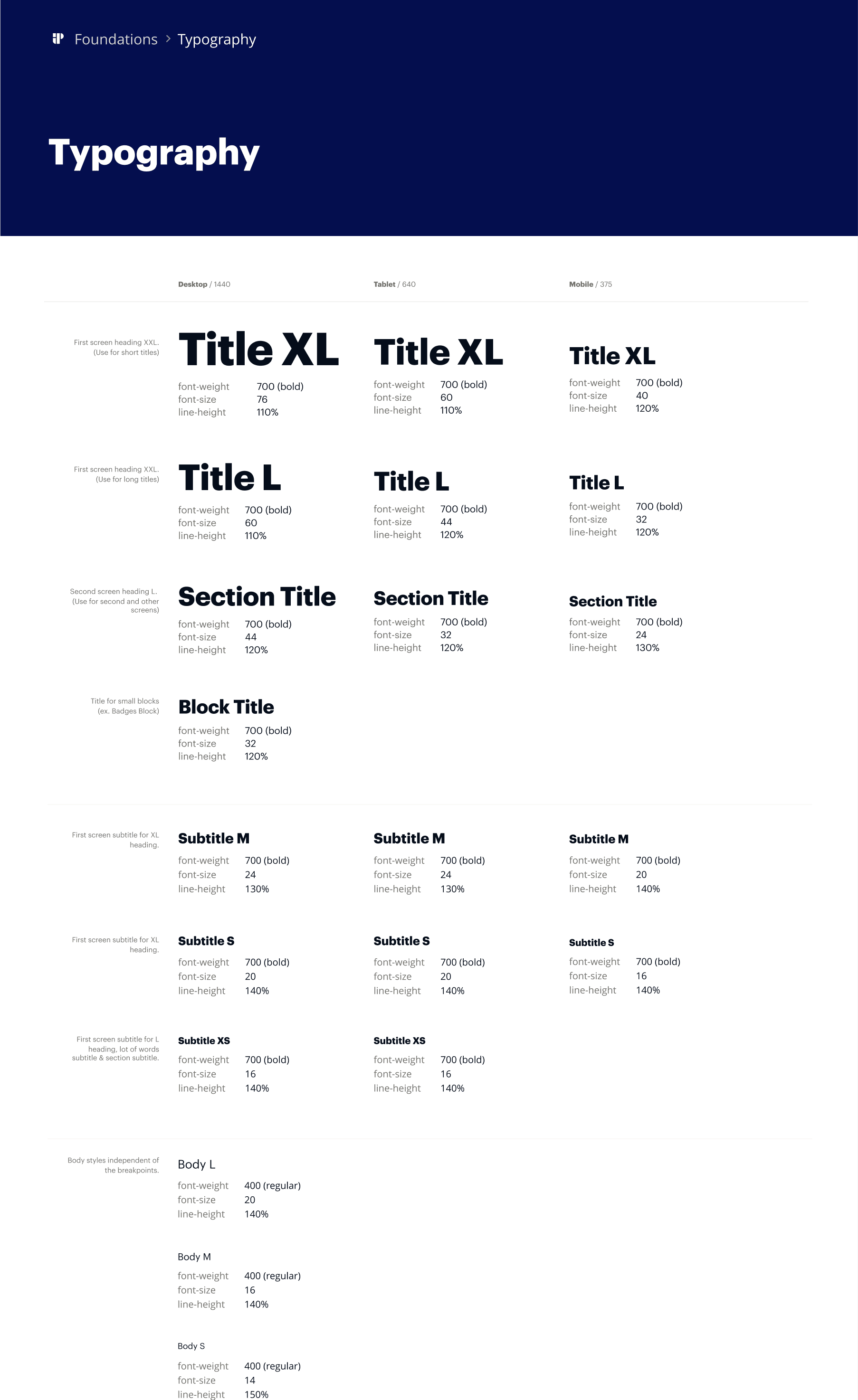
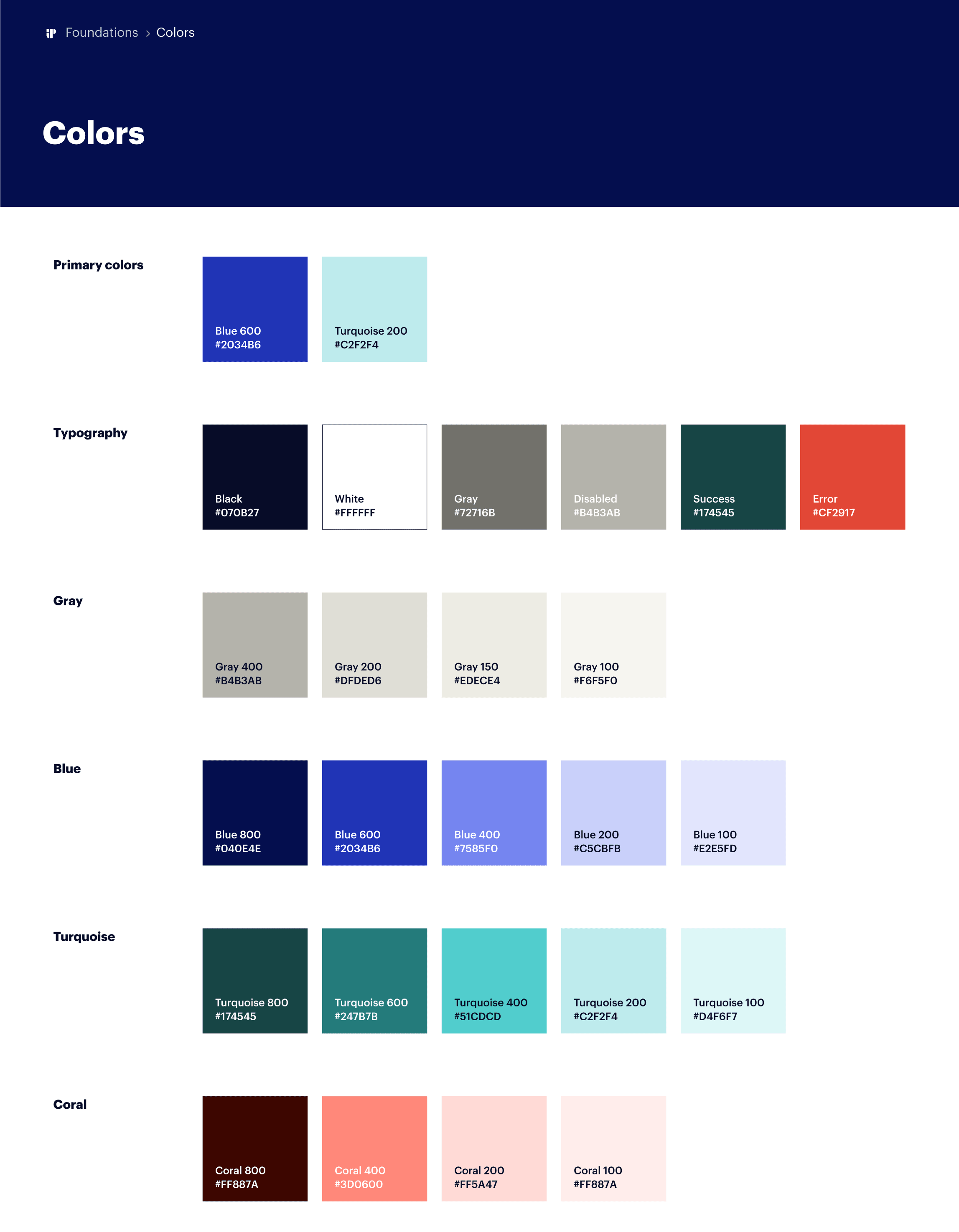
I started with the brand book: cleaned up the color palette, updated the typography, and wrote guidelines the team could actually use day to day. From there I built a design library in Figma. It covered everything the marketing team needed: type scales, color combinations, grids, spacing rules, all the UI components (inputs, dropdowns, checkboxes, toggles, pagination), ready-made page blocks, forms, page templates, and ad layouts. The goal was for the team to build new pages without starting from scratch every time.
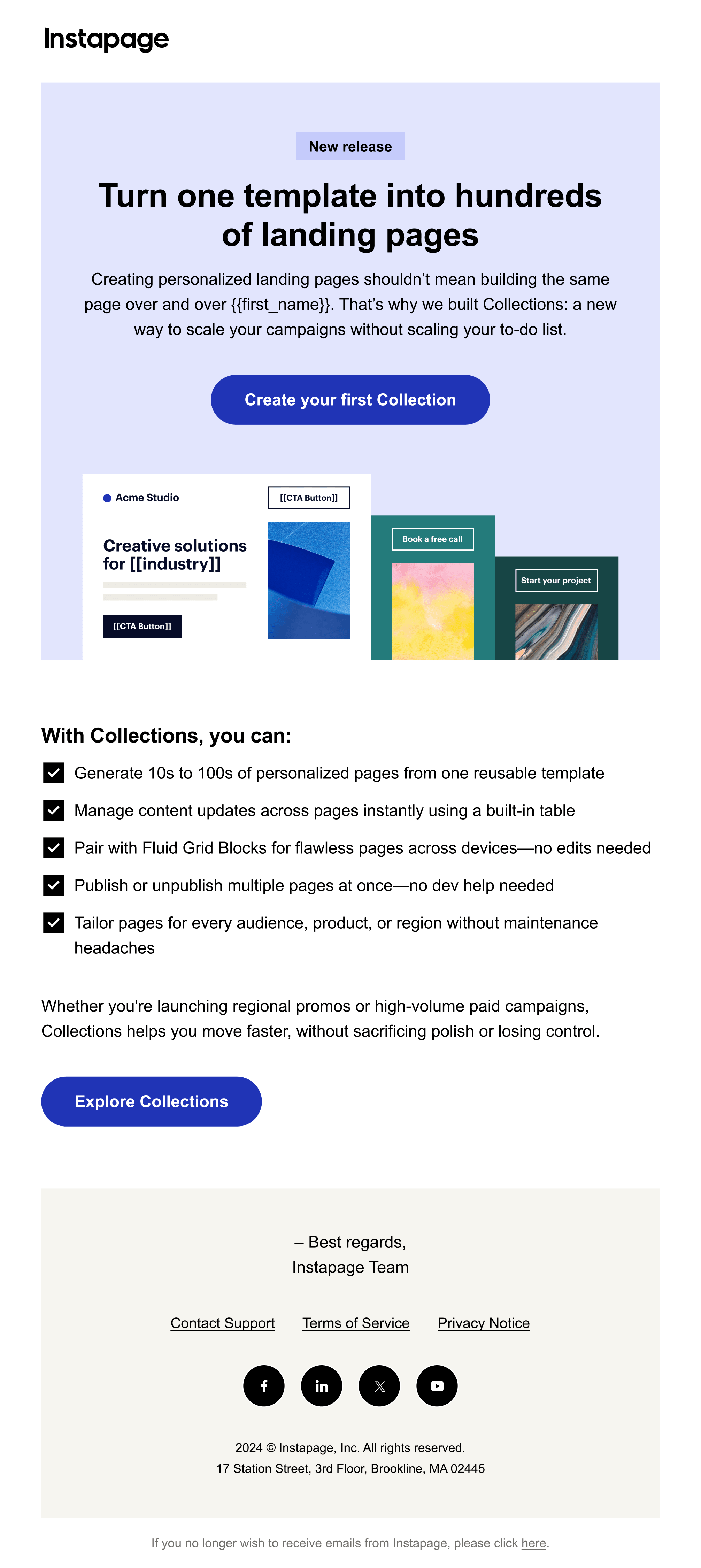
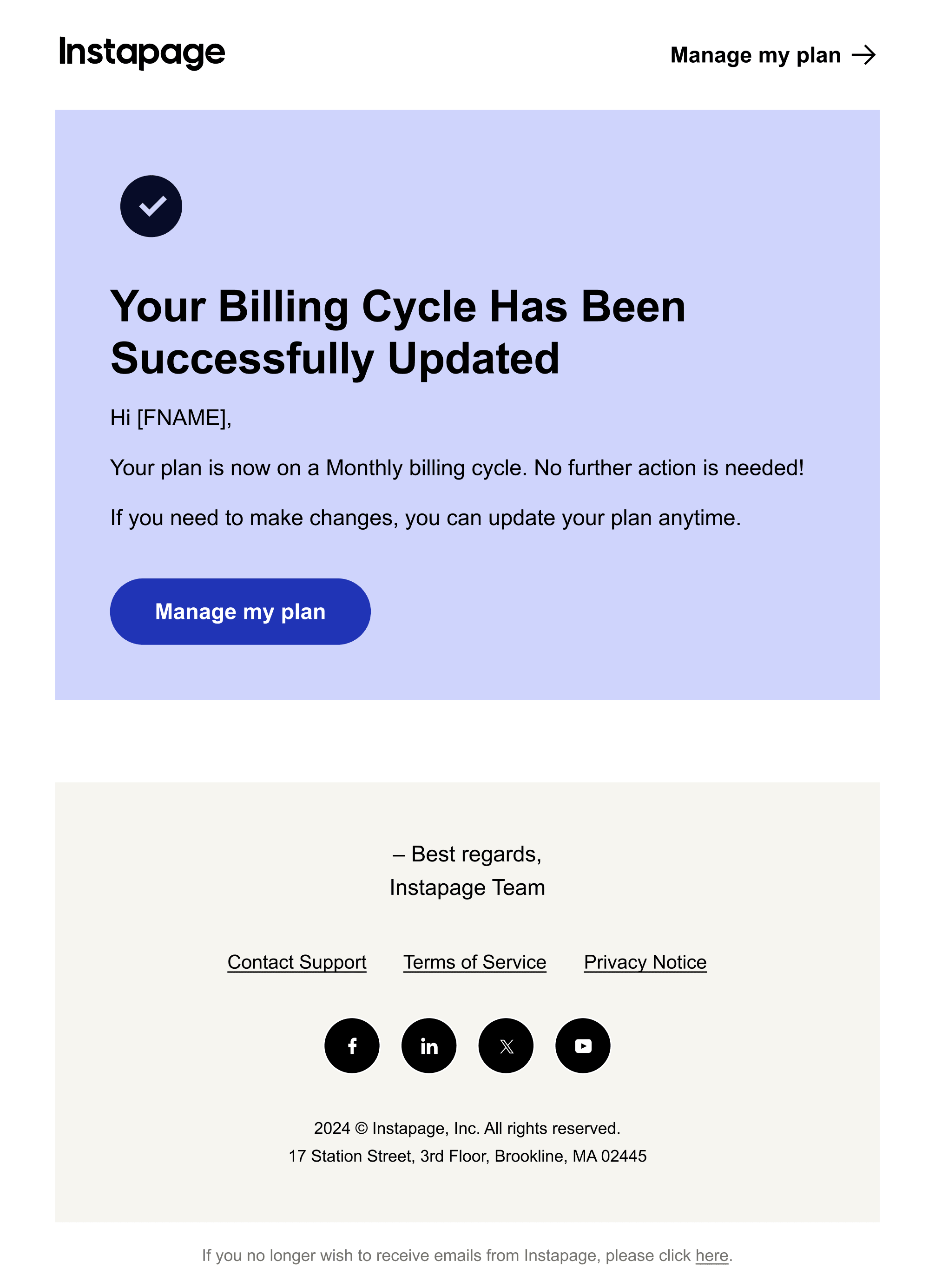
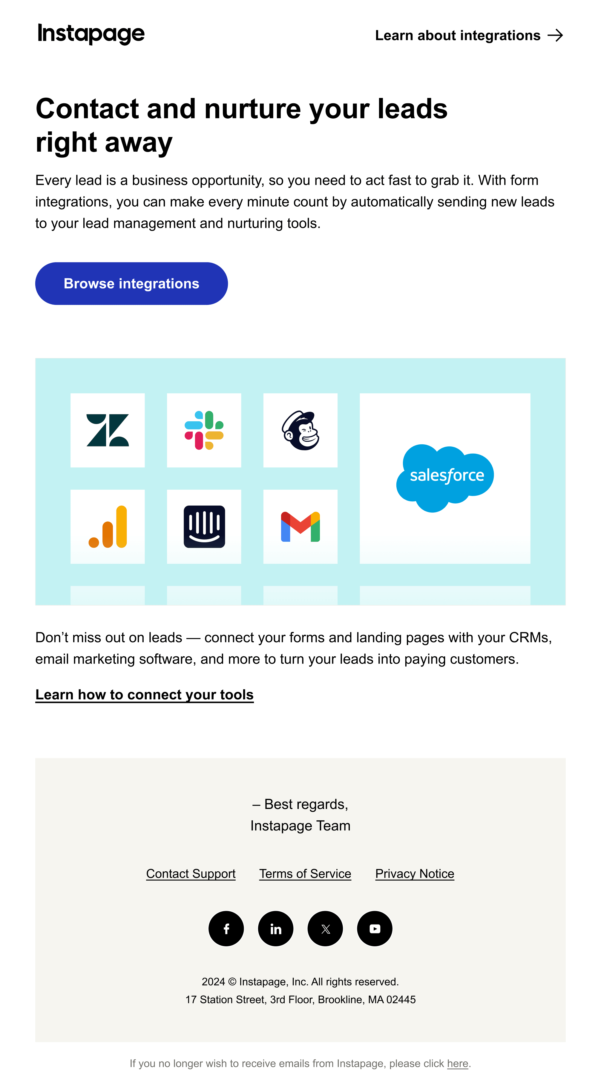
We created a separate email library with documentation and sections ready to use. It worked well enough that the email team could assemble most emails on their own and only come to us when they needed new graphics.
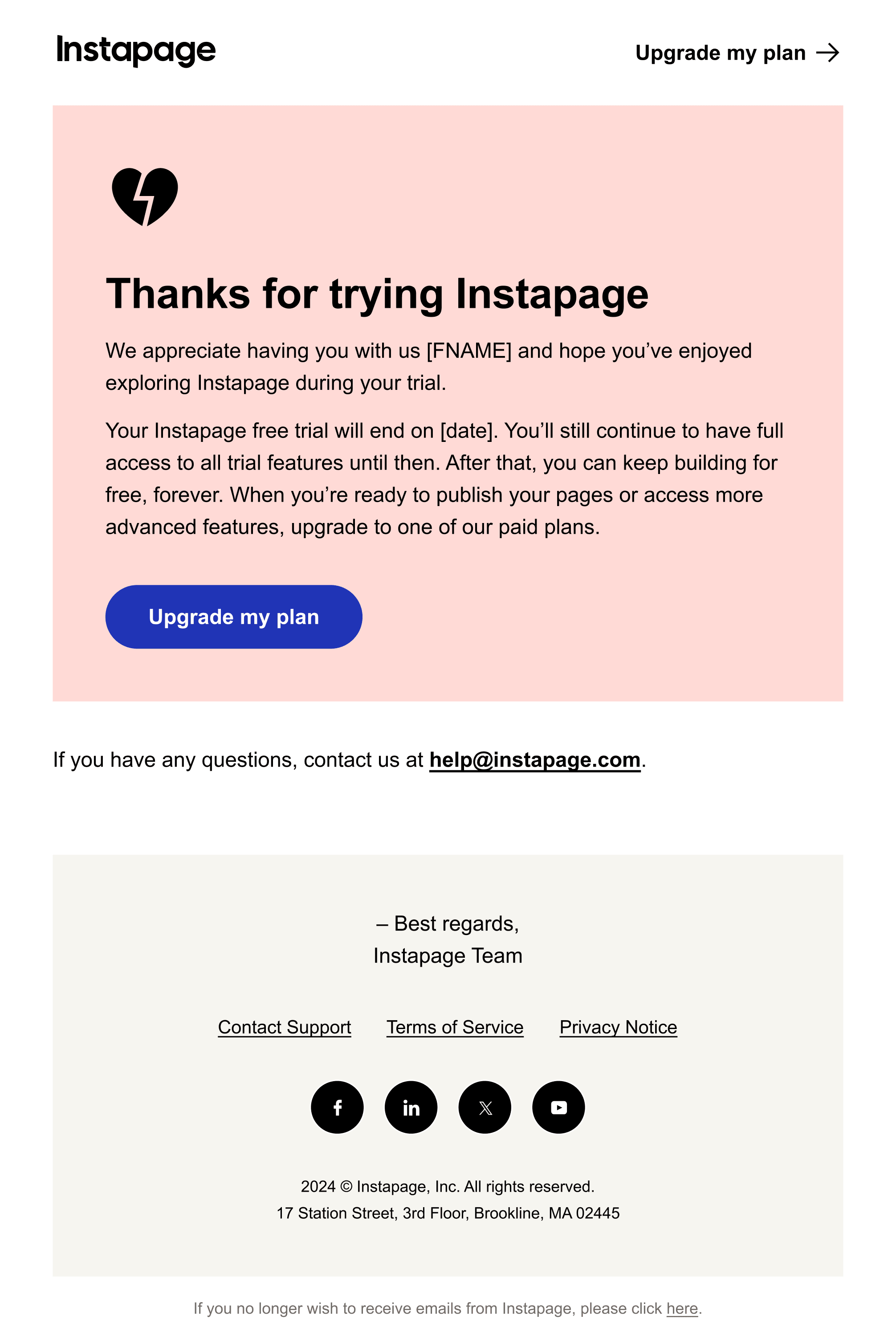
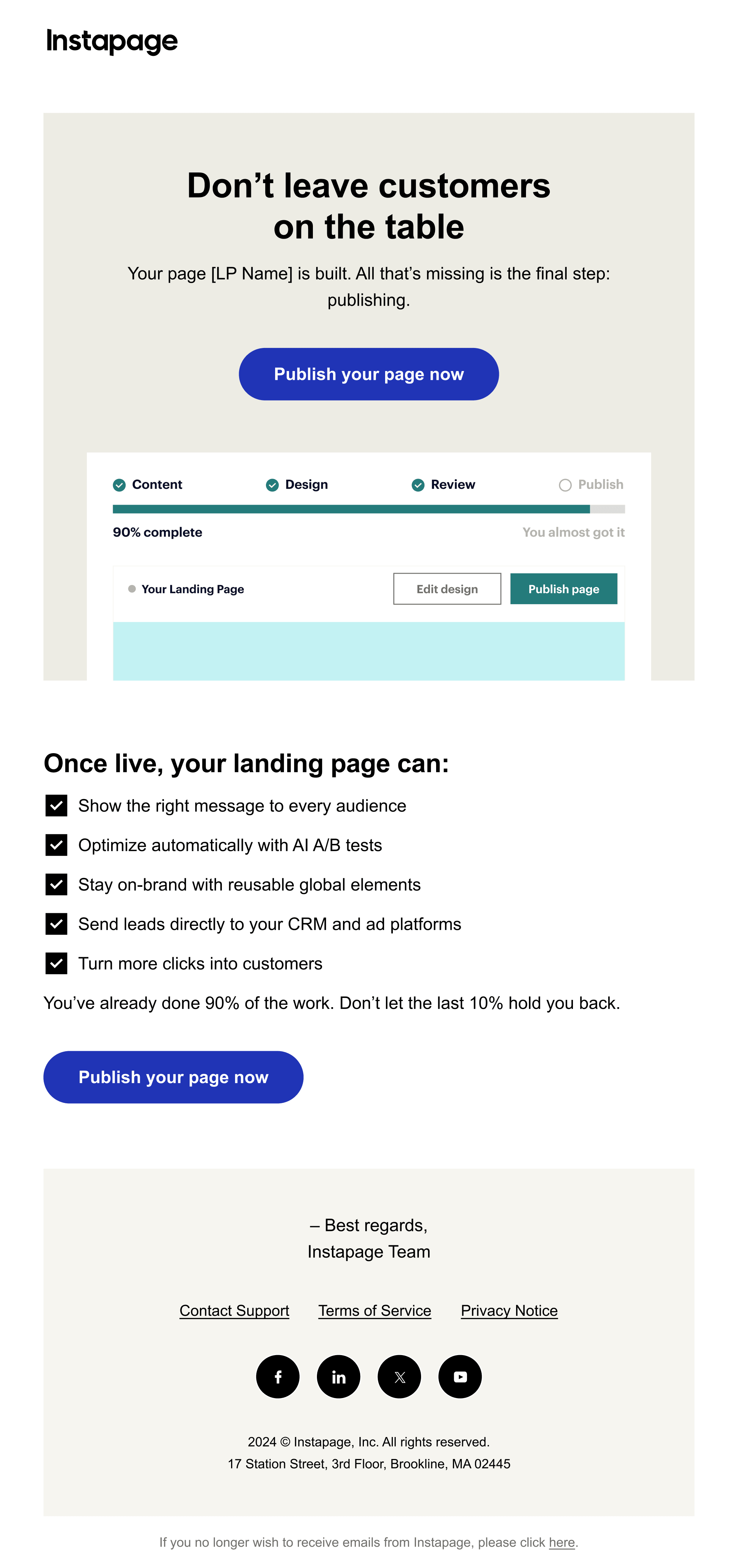
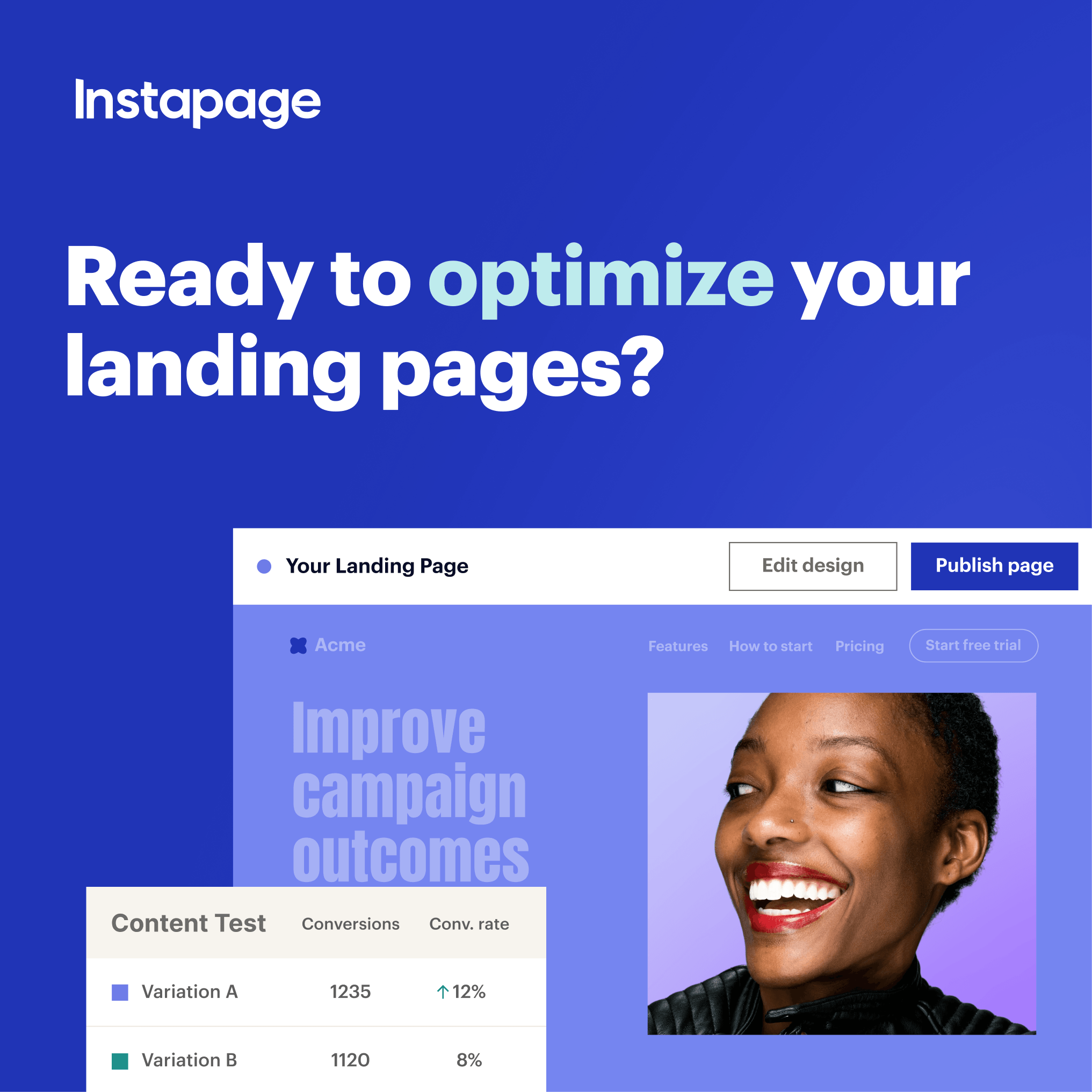
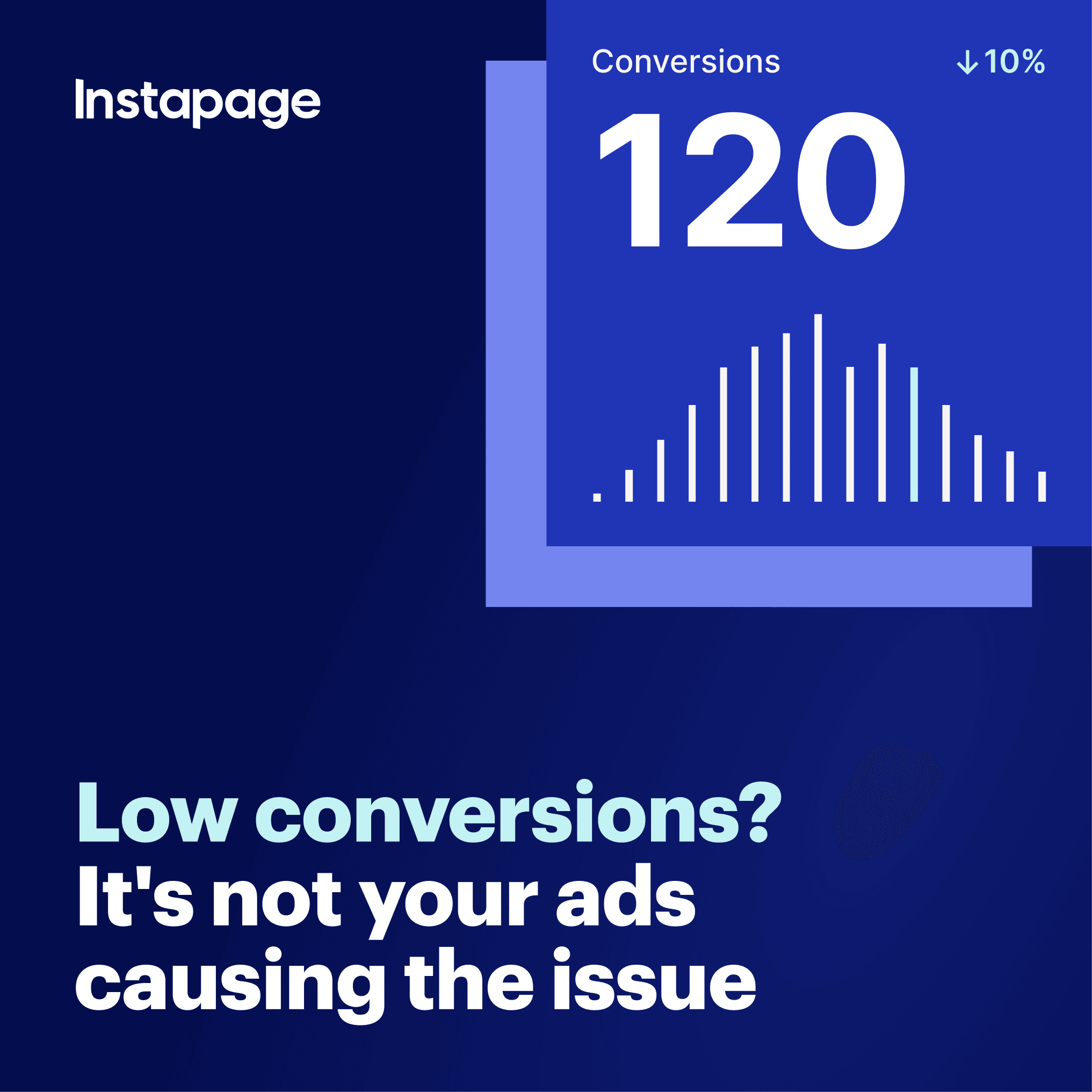
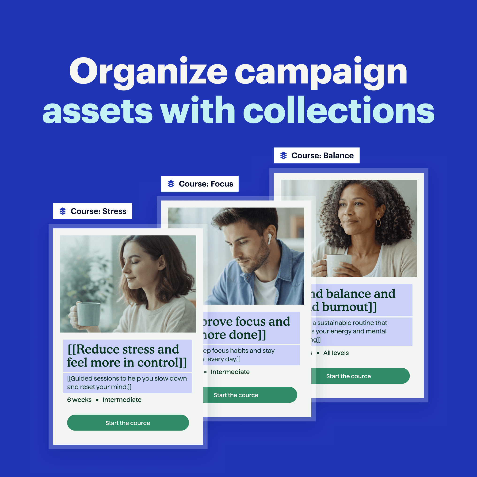
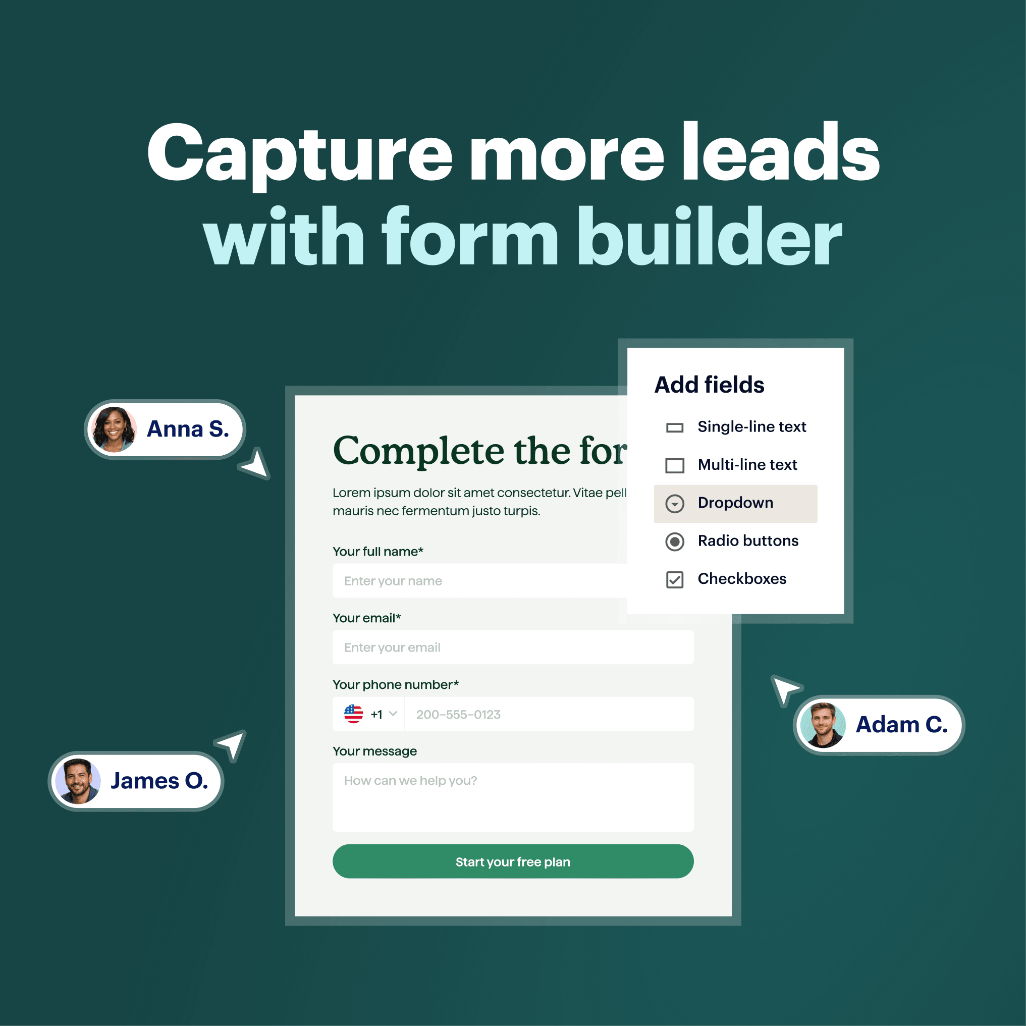
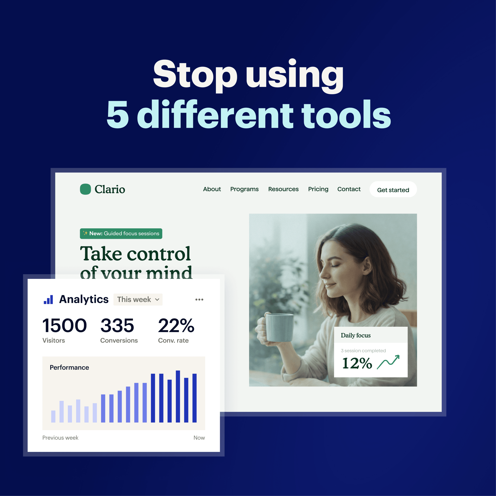
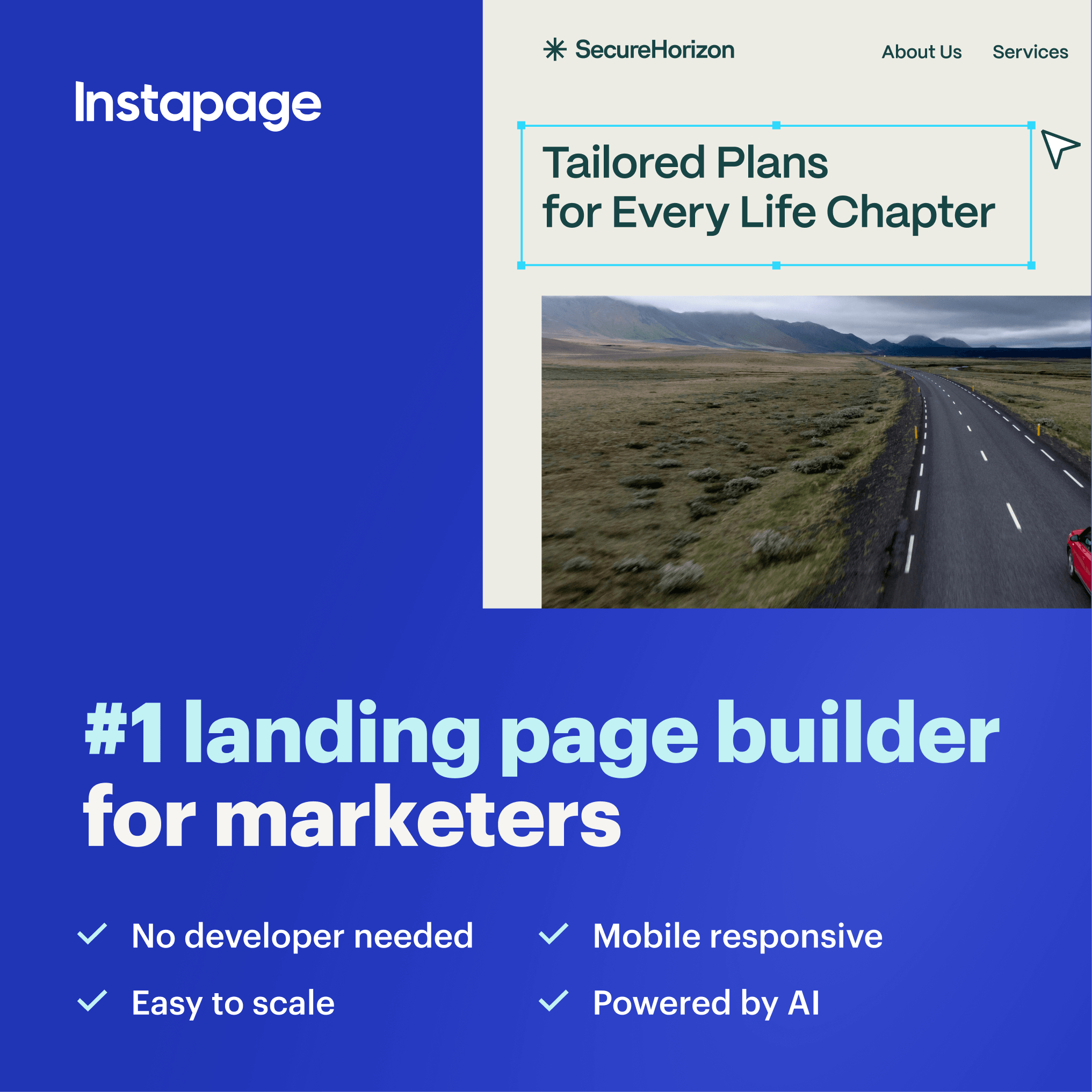
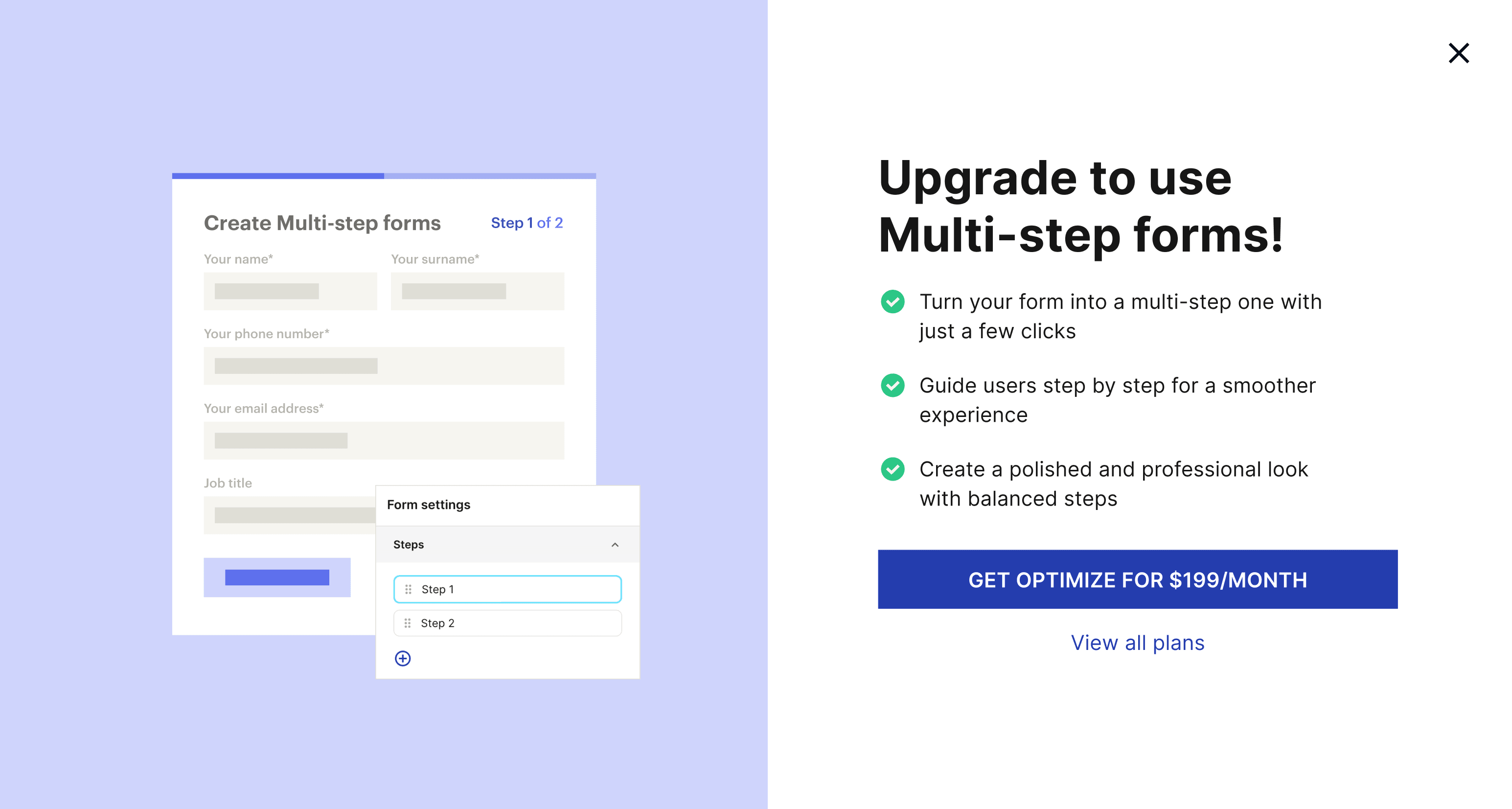
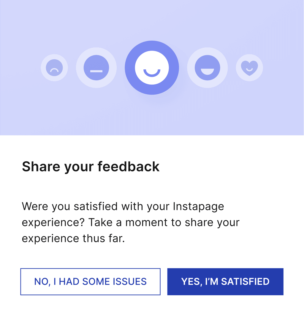
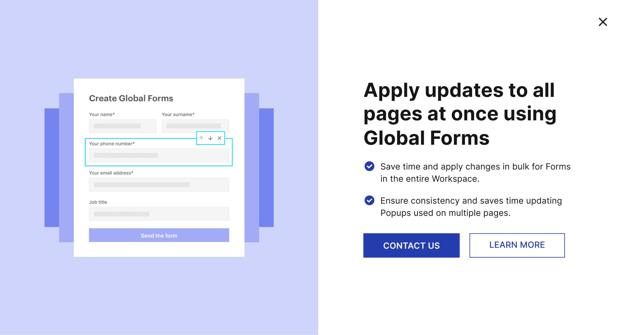
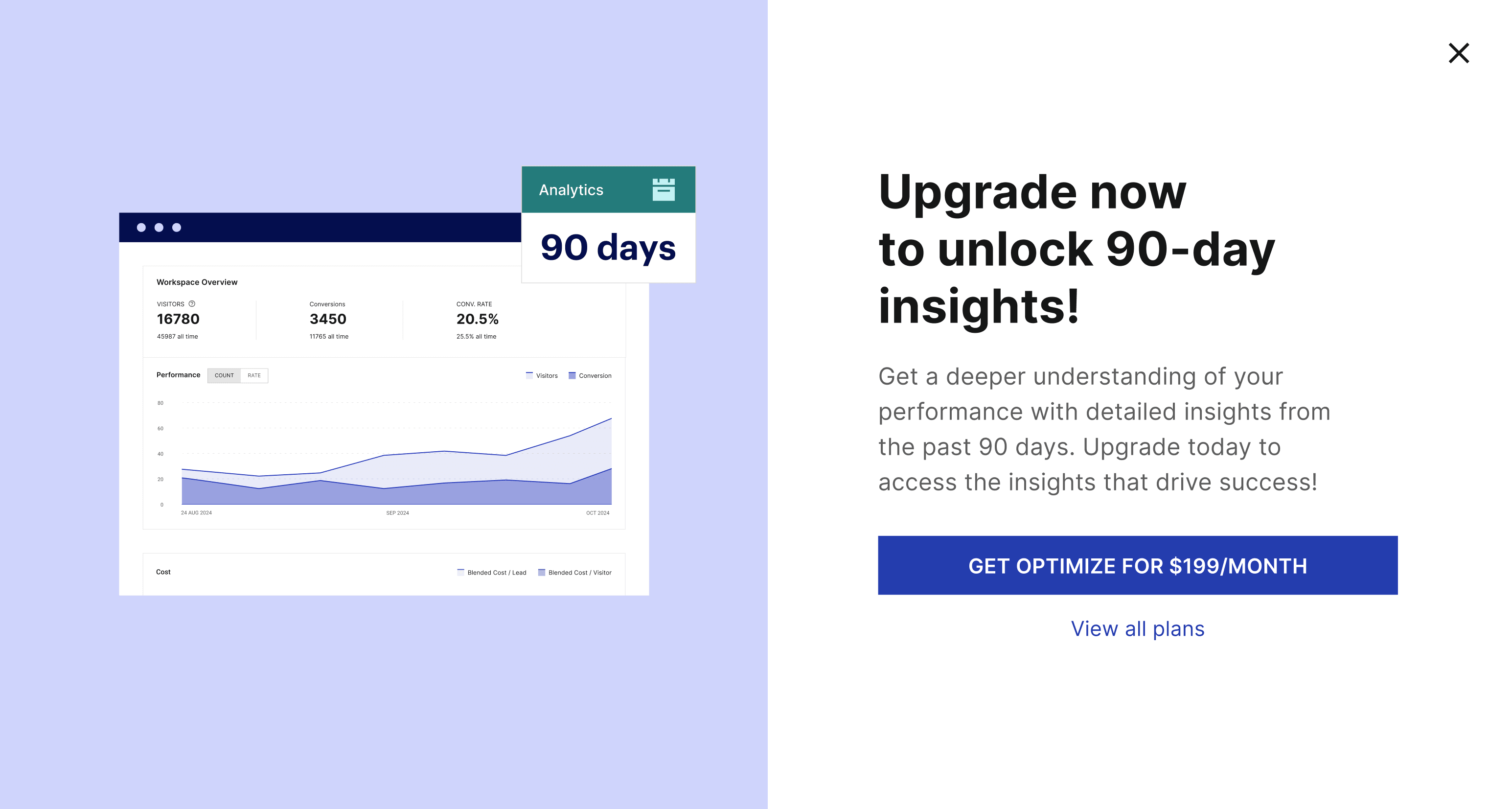
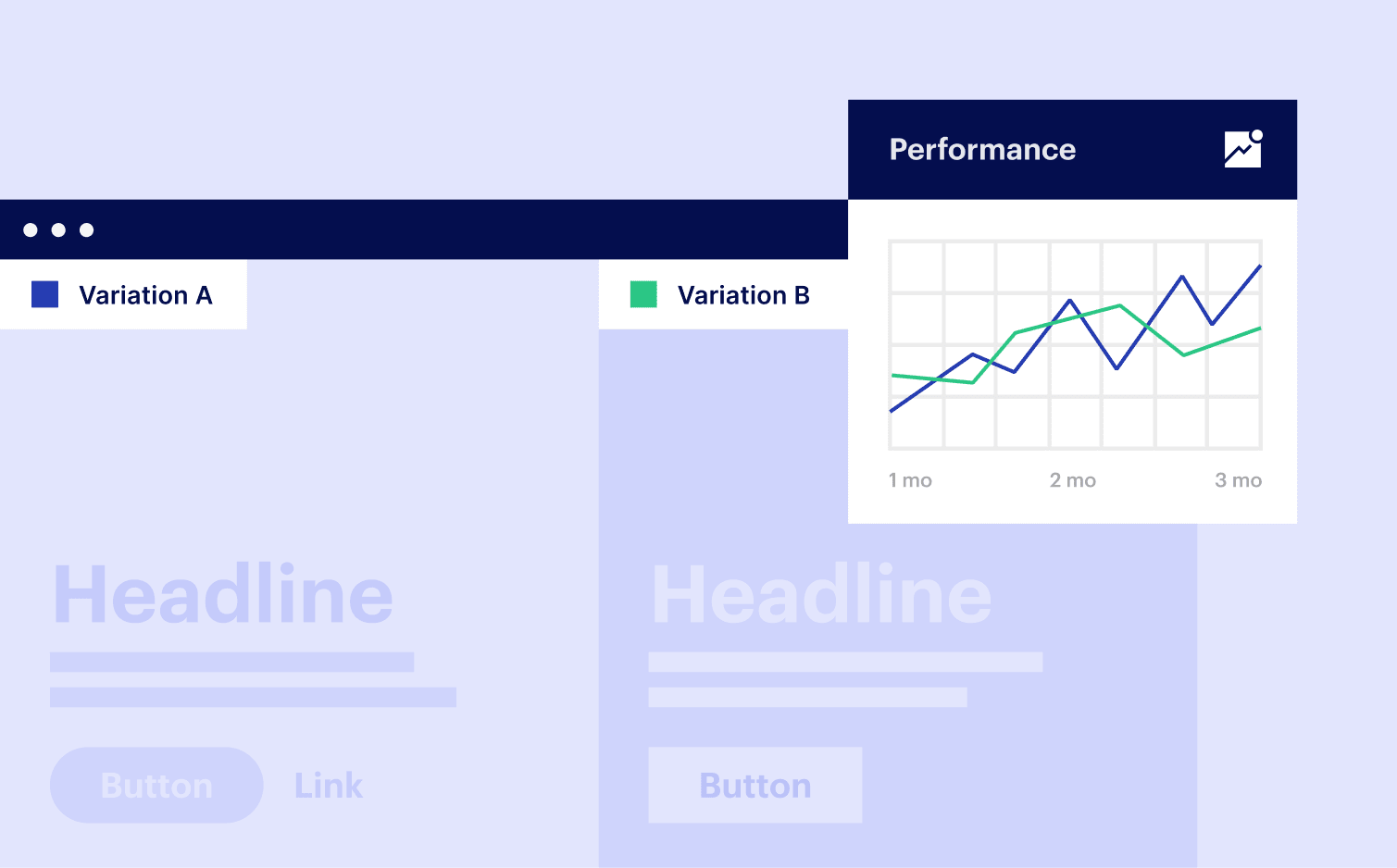
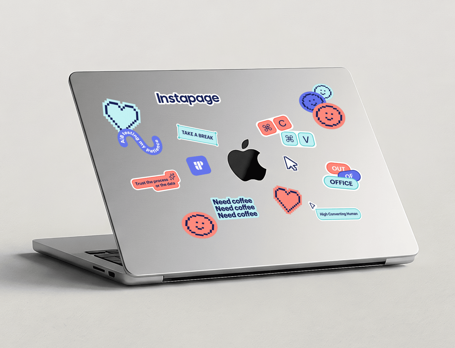
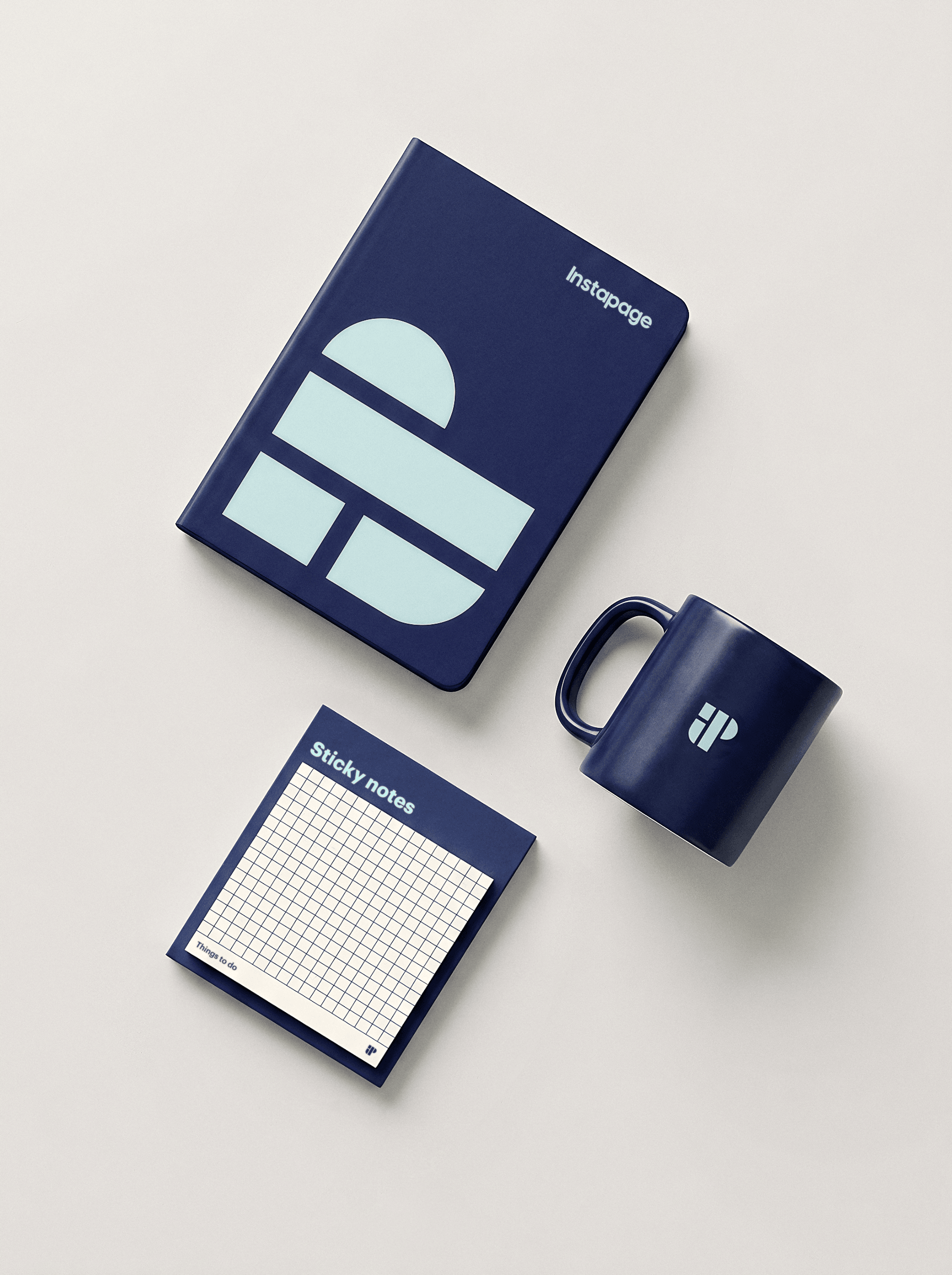
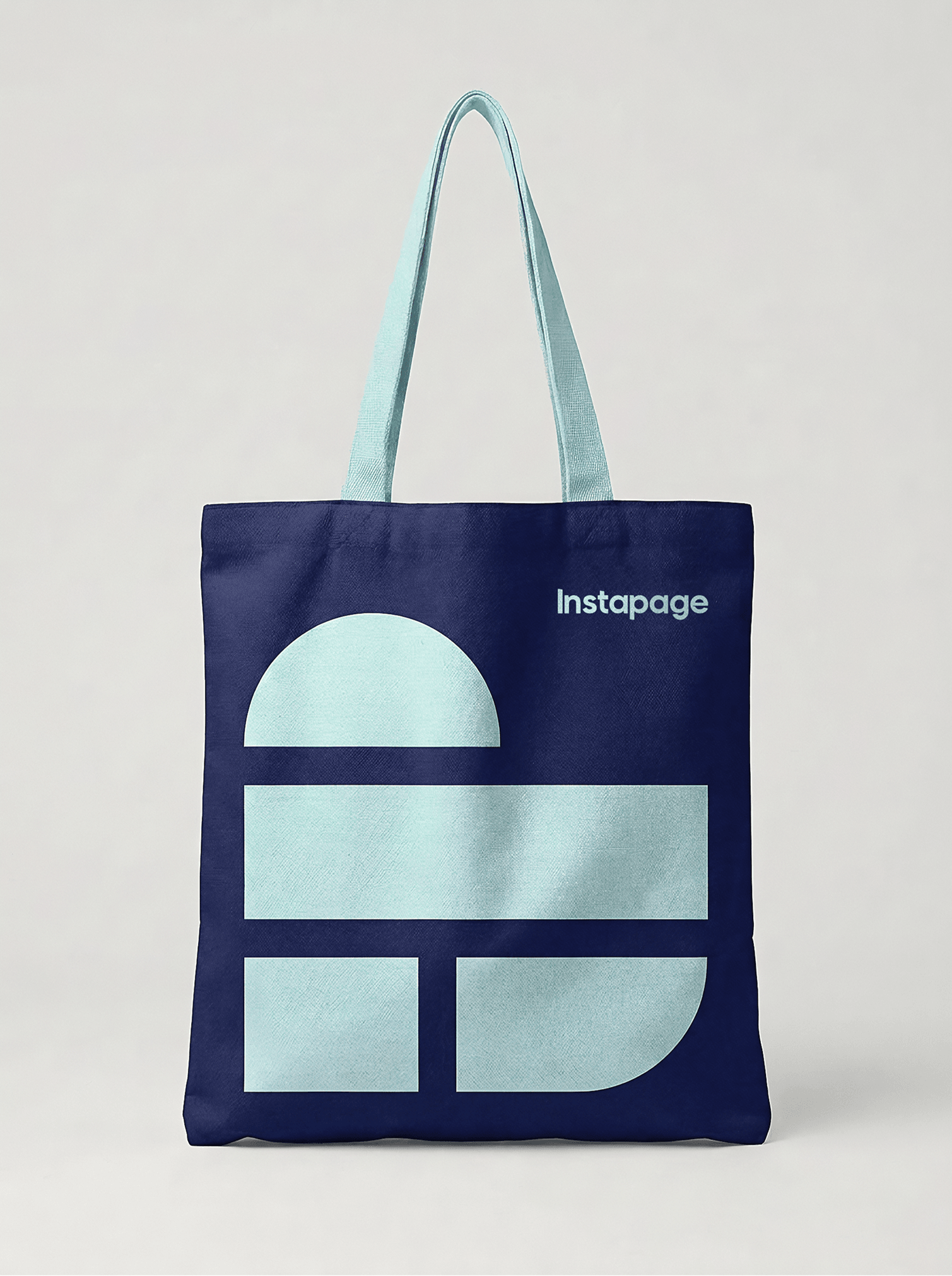
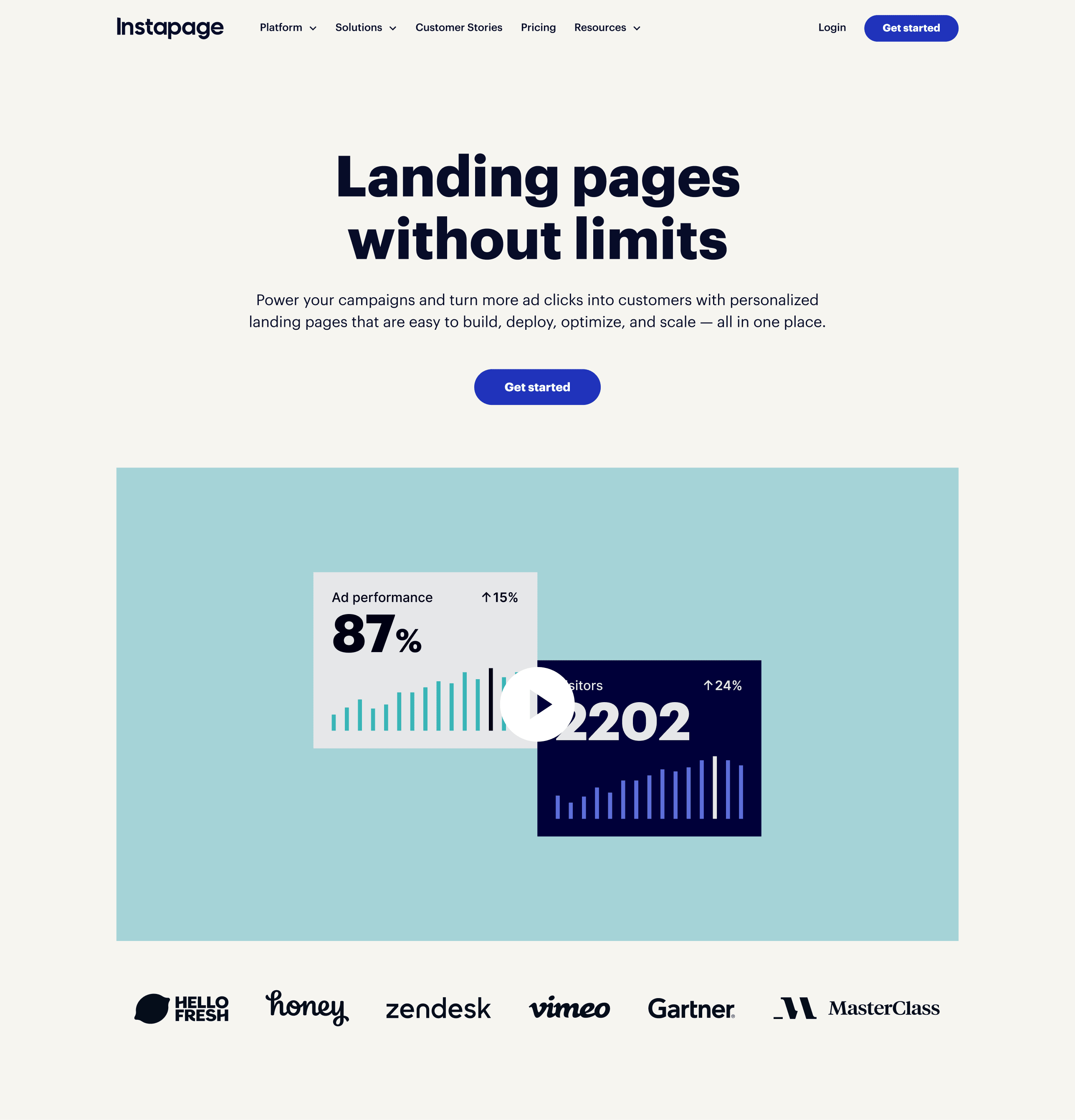
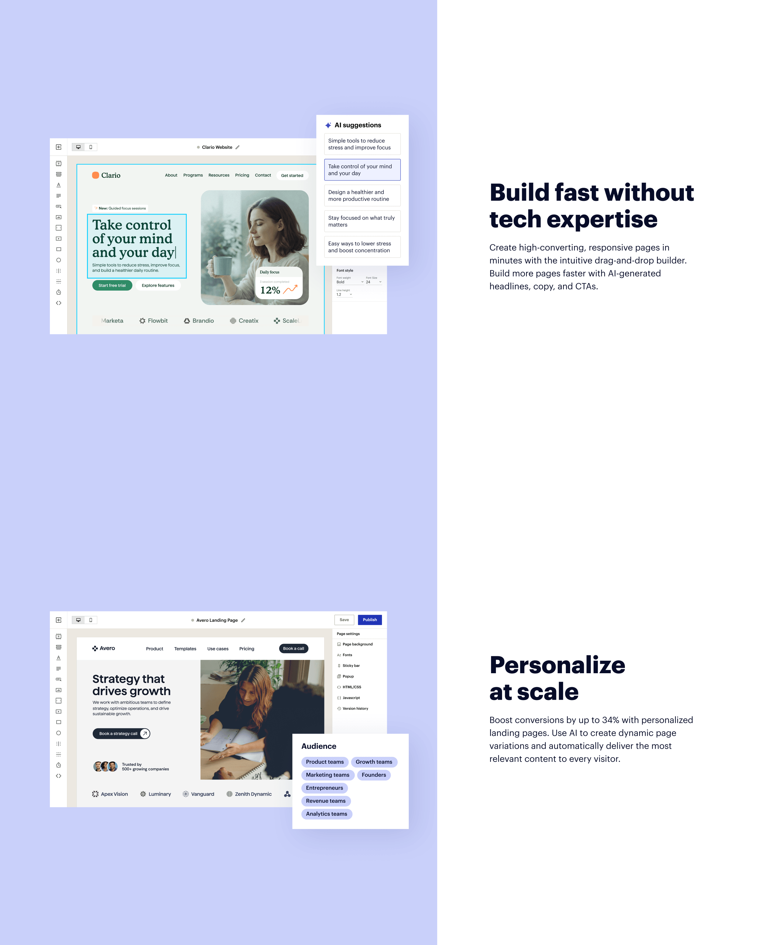
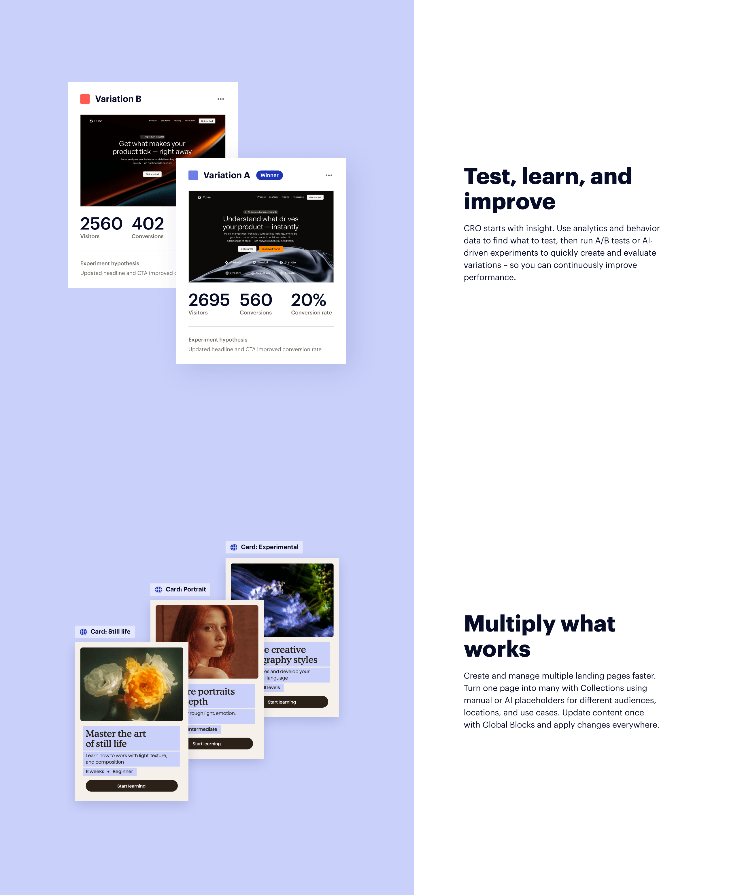
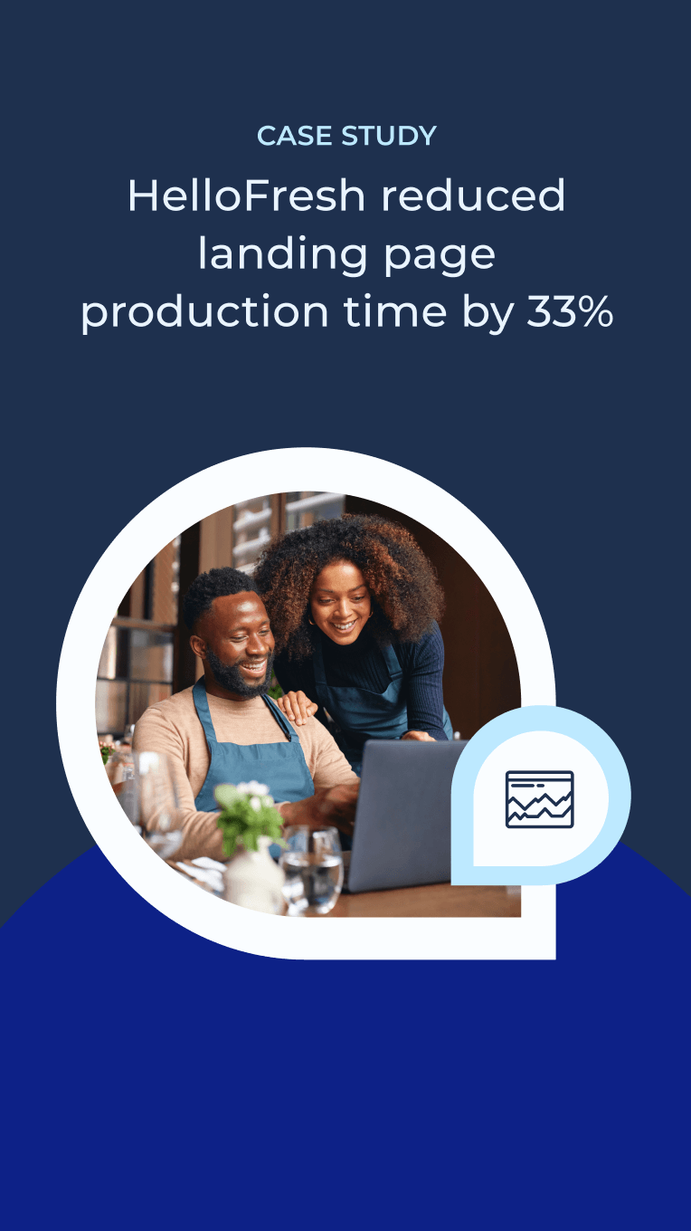
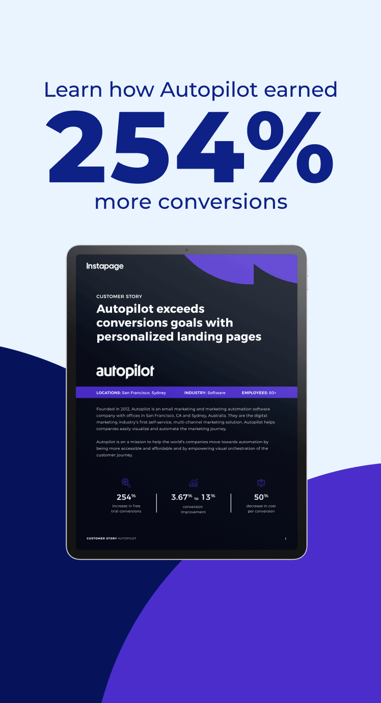
Once the system was in place, we redesigned the website and landing pages, emails, ads, social media, product visuals like popup illustrations, in-app graphics, and merch. We also ran A/B tests on the website to make sure the new designs actually converted better.


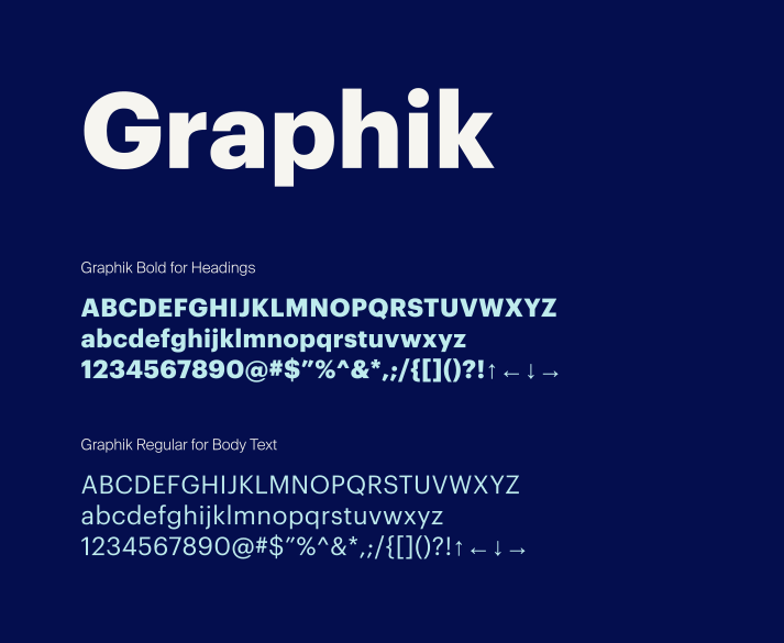

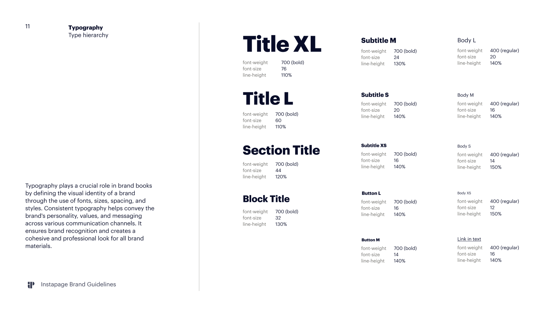
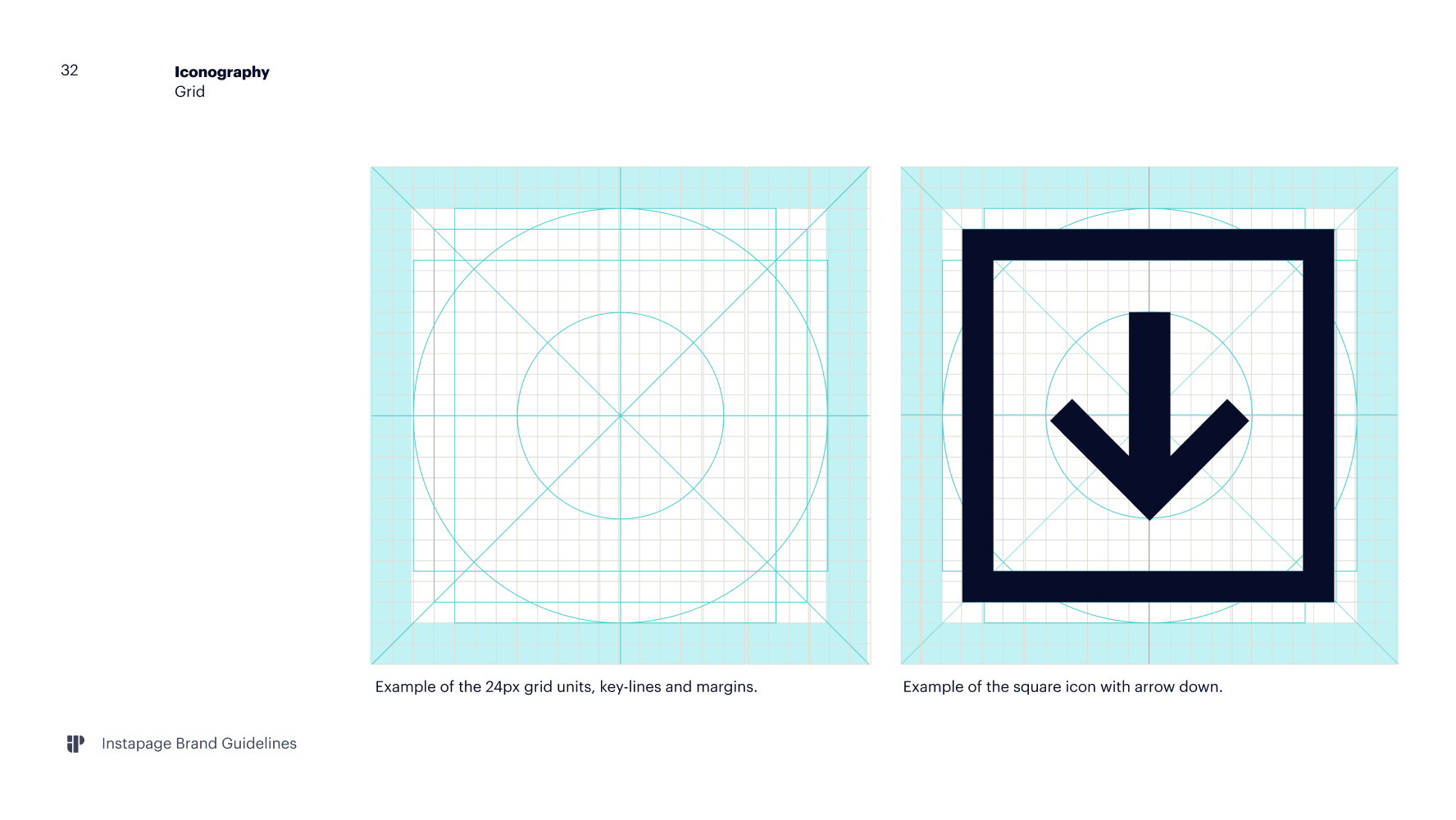
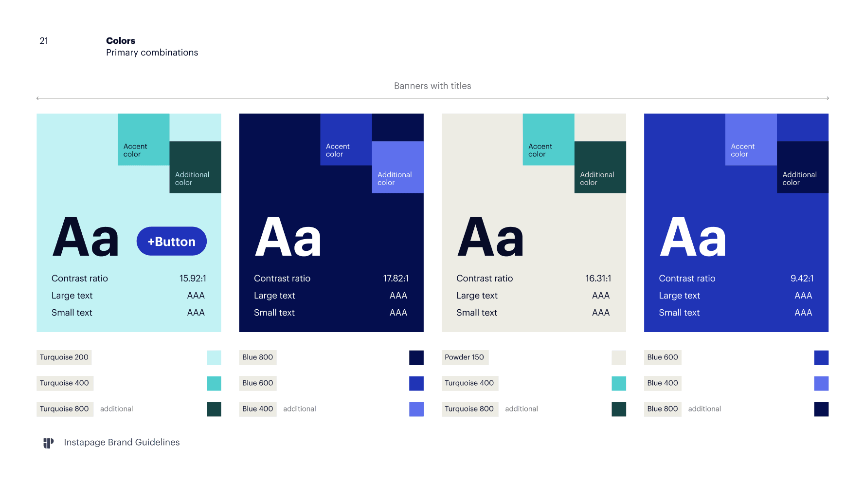
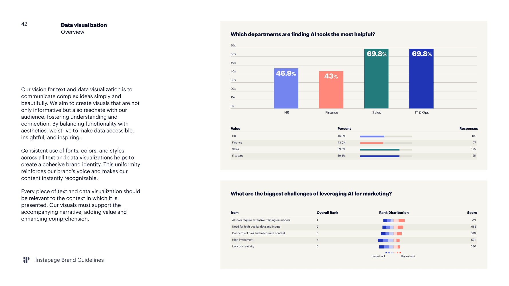
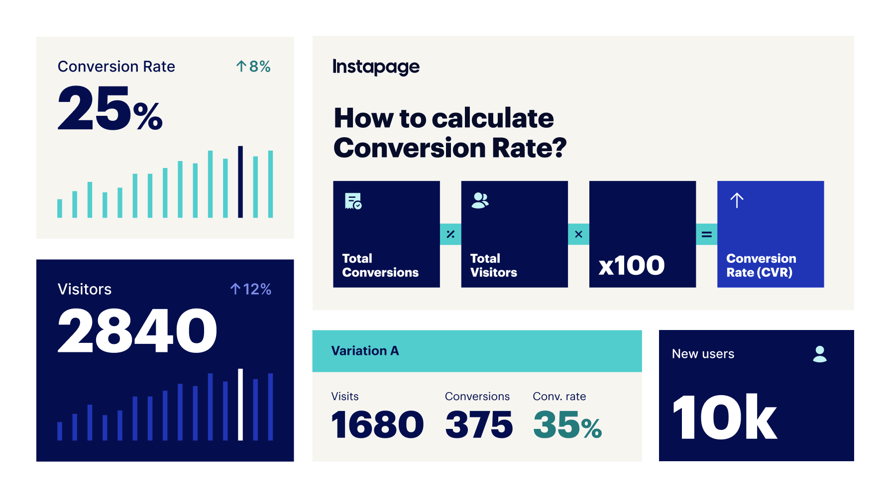
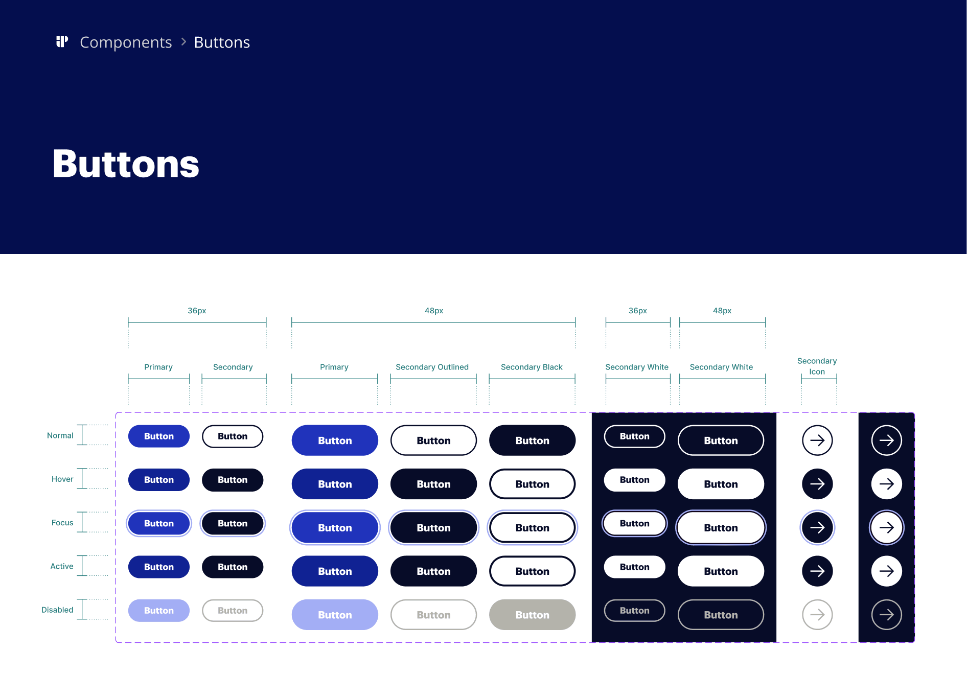
The updated pricing page saw a noticeable boost in conversions after launch, and lead volume increased across the redesigned pages.
With the brand book, design library, and templates in place, the brand stopped drifting. Website pages, emails, ads, and social finally looked like they came from the same company, and individual pages on the site no longer read as separate projects.
The system also changed how the team worked day to day. Routine work got faster, especially on pages that already had a template, and there was less room for error, since the rules and components were set rather than decided each time. The email team could put most newsletters together on their own and only came to design for new graphics.